Main

January 28, 2009

Scott McCloud on Comics at TED

Scott McCloud talks comics at TED. If you don't know who McCloud is and you're interested in comics, videogames, interactive texts, media theory, or pretty much anything, you should go watch. (Fucking brilliant.) Then go buy his books.

[via Drawn!]

December 30, 2008

Helvetica by Other Means

fonts.jpg

Autobahn recreates Helvetica in 'toothpaste, hair gel, and ketchup. Which is not that odd (who hasn't redone fonts in toothpaste?); the interesting part is that they digitized the forms and converted them to fonts that they've released for free.

[via Designboom - Weblog]

"Paris, the city of light, so open"

invisible.jpg

Latour's Paris: Invisible City is off the ground, virtual-wise, anyway. On the other hand, I can't get the Flash interface to really work (in Mac or Windows) unless I'm missing something, which is less promising. So this is more of a movie trailer for something I look forward to seeing..

[via metafilter.com]

December 06, 2008

Eames Shell Chair Construction Video

Crafting an Eames chair: "Something of How They Get the Way They Are."

[via metafilter.com]

December 05, 2008

Dissertation as Interpretive Dance

Gonzo Labs/AAAS asked PhD students to translate their dissertations into interpretative dances, then post the performances to YouTube. Here are the winners.

Above is Vince LiCata's Resolving Pathways of Functional Coupling in Human Hemoglobin Using Quantitative Low Temperature Isoelectric Focusing of Asymmetric Mutant Hybrids, which Randi Zuckerberg describes as falling "somewhere between a prayer, a baseball game, and a round of Kumbaya."

[via metafilter.com]

December 03, 2008

Star Wars + Everything Else

John Powers' dense, sprawling, provocative star wars: a new heap (or, How I learned to Stop Worrying and Love the Death Star) filters George Lucas' movie through Kubrick, Kandinsky, Diego Rivera, the Pruitt-Igoe low-income housing projects, Thomas More, Frederic Jameson, OMA, Jane Jacobs, Venturi, and more. It's sort of dizzying, in a good way.

Unlike the residential architecture of Robert Venturi, which invokes bygone palaces, Star Wars was not a retreat to the imagery of past. Lucas was not reacting against the dominant program of faux-industrial imagery, which Venturi righteously criticized. Venturi’s passive ambit of comforting the old with a palatial appliqué had nothing to do with the modernist compulsion to make it new. Lucas, like Smithson, Morris, and Jacobs, dug deep into the dominant ethic of rationalizing the inconsistencies and contradictions of modern senescence. Star Wars built on the radicalism and procedural logic of minimalism and made a bold visual assertion, proposing a future “drawn not from how it ought to be, but from how it is.” In defiance of conventional wisdom, Lucas revealed a place that was modern, but not new, a future long occupied, unfinished, worldly. Modernity is the presumption that the natural environment for man has yet to be built. Lucas was the first to imagine that future built environment as already old.

[via kottke.org]

Touchscreen Stencils

gesture.jpg

Dan Saffer is releasing the stencils for gestural interface design book he just published, cunningly titled Designing Gestural Interfaces. The stencils, taken from Rachel Glaves' drawings for Saffer's book, are available in multiple formats (OmniGraffle, Illustrator, Photoshop).

On a directly related topic (I so infrequently have a segue), check out Rachel's photo of her process for creating gestural icons.

[via Kick It]

November 30, 2008

Junkopia

Ubu.com has Chris Marker's short film Junkopia:

One day, at the stroke of evening, on Emeryville beach in San Francisco, where unidentified artists, leave, without anyone knowing, sculptures manufactured with items that have washed ashore from the sea.

This includes a short introduction by arte, approx. 1:12 secs long, with the film being around 6 minutes itself....there are 2 intertitles in the film itself, giving the latitudanal and longitudanal co-ordinates of the beach. No subtitles required, but ill work on some anyways.

[via Chris Marker]

November 19, 2008

Designing Logos

logo-process.jpg

Cool: Design Walker covers the processes used by seventeen designers to create new logos. With, as you might guess, extensive, in-process examples. Above is one from Chuck Green's tutorial covering logo design for a helicopter transport company.

[via Basement.org]

November 15, 2008

Visual_Output


Richard Devine & Josh Kay from surachai on Vimeo.

[via trash_audio]

November 12, 2008

Thar She Blows 2.0

pmd.jpg

The Power Moby-Dick heavily annotates an online version of the novel (which I finally read last summer--this would have been useful if I'd known about it).

(I cribbed the title from the Metafilter post where I found this.)

[via metafilter.com]

November 03, 2008

A Gamer Reviews "Outside"

Somewhat buried in the comments on a mefi link to an article on gamers and media, a gamer reviews this thing called "outside." Here's a short snip from the longer piece:

In terms of the social environment, almost anything goes. Outside has a vast network of guilds, many of its players are active participants in designing the game's social environment, and almost any player will be able to find company to undertake their desired group quests. On the other hand, gold-buying is rife, the outskirts of virtually every city zone in the game are completely overrun by farmers, and the developers have so far proven themselves reluctant to answer petitions, intervene in inter-player disputes, or nerf broken skills and abilities. Indeed this reviewer will go so far as to say that the developers are absent from the game entirely, and have left it to its own devices. Fortunately, server uptime has been 100% from day 1, despite there being only one server for literally billions of players.

[via The Morning News]

October 31, 2008

Poladroid

Tombstone

Free Mac application Poladroid, as you can probably guess, processes digital images to give them that Polaroid look (and feel--you can shake the little image to make the image develop more quickly).

[via Lifehacker]

October 17, 2008

London Underground Tube Map Documentary

Smashing Telly located a 25-minute documentary on the London Underground tube map, a design classic. (The map, not the documentary. Although the documentary itself is pretty good.)

[via kottke.org]

October 16, 2008

When NSFW is Your Work

Putting People First links to several articles about the usability research that went into the development of Philips "intimate massager" products. Here, for example, is a clip from "The Birth of a New Category" written by the product team at Philips:

The delicate nature of the subject meant that exhaustive research was carried out. Early propositions were validated through qualitative testing panels, followed by quantitative testing on the Internet. More than 100 working prototypes were tried out in Austria by typical representatives of the target group. And testing wasn't limited to consumers; many different stakeholders from Consumer Lifestyle, Healthcare and Lighting became involved as well. Even financial analysts were consulted. "In my 25 years of business experience, I've never been associated with a line of products which has been so thoroughly vetted," said Jim Hey, Senior Vice President and Business Unit Leader for Health & Wellness.

[via Putting people first]

September 28, 2008

TRASH_AUDIO: Workspace and Environment: The Great Mundane


The Great Mundane Trash Audio Interview from push the button on Vimeo.

[via TRASH_AUDIO]

September 06, 2008

Heavy-Duty Sampling

Johannes Kreidler's "Product Placement" (above) a 33-second remix that uses 70,200 samples to create a glitch-heavy masterpiece. (I'm not sure what the criteria are for "masterpiece" in this genre, but Kreidler's clip makes Girl Talk seem like lazy muzak.) Create Digital Music has some background as well as a video of the phone call he made in his attempts to clear copyright for the samples for his work (the licensing agency requires an individual request form to be completed for each sample).

August 25, 2008

Infoviz Art

Check out Slate's slideshow (with commentary), Infoviz Art:

Display an unwieldy mass of data in clever visual form and you may gain über-insight into questions you hadn't yet put into words. That is the promise of information visualization, infoviz for short. The field has long helped scientists, engineers, and businesspeople see the unseen as it emerges from complex data: Users may spot promising molecules for pharmaceutical testing, for instance, or pinpoint glitches in a supply chain. As infoviz has matured, it has also caught fire as an art form, its center of gravity edging further from the pragmatic and closer to the expressive or the whimsically profound.

[via Fimoculous.com]

August 24, 2008

Typographic Zen

Web Zen this week covers typographic zen: the helvetica vs. arial videogame, typographic animations set to Dylan and Zeppelin tunes, Cooper Black: Behind the Typeface (a short documentary on Oz Cooper), and more.

August 22, 2008

Artist Studio Tours

NPR has a video and slideshow tour of artists' studios and work at the 52 0 Street complex, a renovated warehouse in DC.

[via To the Beat]

August 18, 2008

When the World Was Cool

Society in Decline has a great Flickr set on old commercial signage, which might be used as evidence supporting Aaron Draplin's [nsfw] rant on contemporary graphic design

August 04, 2008

Ambient Lapse

Kyle McDonald at MIT has created a bunch of interesting audio/video/music Processing apps, including the Ambient Lapse program shown above (which uses both Processing and SoundStretch).

"Ambient Lapse" is a simple technique for capturing the ambiance of spaces, especially their color and spectral characteristics. It operates on a principle similar to long-exposure time-lapse, but allows exposures to overlap. Instead of producing momentary bursts of specific images, individual objects and well-defined perspectives, we're given vague impressions.

[via createdigitalmusic.com]

August 01, 2008

Color Design as Narrative Device: 101 Dalmations

AnaimationExpressions on color design in 101 Dalmatians, in what's projected as the first of an extensive series. (Disney, I think, is where I learned most of what I know about color design.)

July 29, 2008

Tarantino's Mind

tarantinosmind2.jpg

From the oddly named Hungry Man TV, the short film Tarantino's Mind. Nice.

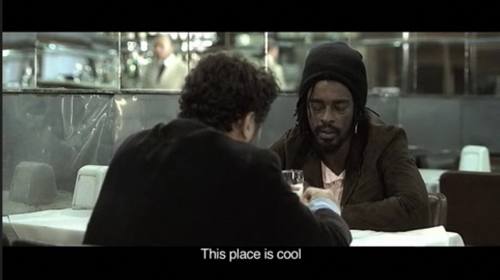
A film buff tells a friend that he's finally broken "the code" - the mystery behind the character & story threads that bleed from one Quentin Tarantino movie or screenplay into the next. His friend is less than impressed. Starring Seu Jorge (The Life Aquatic) and Selton Mello (Tarja Preta). A short film by Brazilian directing duo 300ml.

July 22, 2008

Instruments and Playable Text

Stuart Moulthrop guest edits the Iowa Review Web's issue on Instruments and Playable Text:

Judy Malloy, "Concerto for Narrative Data

John Cayley, "riverIsland QT"

Nick Montfort, "The Purpling"

Shawn Rider, "So Random" and "PiTP"

Elizabeth Knipe, "activeReader"

Stuart Moulthrop, "Under Language"

[via Mark Bernstein]

July 20, 2008

Chris Marker Weblog

Chris Marker: Note from the Era of Imperfect Memory (a weblog and website).

Chrismarker.org is an randomly-compiled, taxonomically naive and hopefully useful archive of ruminations, bibliographic & filmographic notations, untimely meditations, mnemonic minutiae and other glosses on the cinematic, written, photographic and multimedia work of world-citizen & time-traveler Chris Marker.

We welcome contributions in short article form from the global village that Marker helped to map. We also welcome Chris Marker news, links, memorabilia, aphorisms, quotations, images and stray insights. Contributions from animals are welcome too, of course, including but not limited to cats, owls, giraffes, emus and elephants (слоны).

[via Ballardian]

July 19, 2008

Surveillance

surveillancesaver.jpg

SurveillanceSaver for OS X and Windows screensaver that pulls images from 400+ networked surveillance cameras around the world. The programmers call it a "haunting live soap opera." Creative Commons licensed.

[via things magazine]

July 18, 2008

Making Faces: Typographer Documentary

YouTube (obviously) has the trailer for Making Faces, a documentary on typographer Joe Rimmer.

[via P22]

July 11, 2008

How Designers Work

Time-lapse video of Matt Willey laying out an article for Royal Academy magazine, trying out different options as he goes. This would be even better if (a) it had a voiceover explaining Willey's decision processes and (b), as Kottke says, if it were on Vimeo or some other site that had better video ("... sometimes YouTube is like watching a UHF station from 200 miles away with the rabbit ears positioned just so").

Still, cool.

[via kottke.org]

July 09, 2008

Tracking Shots

laboratory101 has a short history of the tracking shot, complete with YouTube clips. Touch of Evil, Goodfellas, Boogie Nights, The Player (the initial tracking shot of which is itself a history of tracking shots), and of course The Russian Ark (trailer above), which is one 90-minute tracking shot.

July 05, 2008

Off Beat: Piano Phase

Peter Aidu performs Steve Reich's Piano Phase. Normally played by two pianists, "Piano Phase" involves playing the same short melody simultaneously on two pianos so that, over time, one player slides out of phase with the other. Aidu's not the first person to play the piece solo, but it's the first one I've seen on video. (An mp3 of the performance is available at the Internet Archive.)

[via Super Colossal]

July 04, 2008

Imagining Behind the Scenes

Channel 4 has a 65-second tracking shot through a reconstruction of the set of The Shining.

Channel 4 Creative Services, the broadcaster's in-house creative resource, cast people who resembled Kubrick's own crew including his script lady, assistant director and director of production, John Alcott, who also worked on films including 2001: A Space Odyssey and A Clockwork Orange with the director.

Look-a-likes were also found for Duvall, Danny Lloyd, who played Danny Torrance, and the twin girls who appear fleetingly in the film.

[via Daring Fireball]

July 02, 2008

The Street Finds Its Own Uses: Web 2.0 as Literature

Mark Merino provides links to examples of Web 2.0 tech repurposed as (experimental) literature and poetry: Jay Bushman's The Good Captain (Twitter repurposed to repurpose Melville's "Benito Cereno"), Charles Cumming's The 21 Steps (short story as Google Map), and more (including RSS feeds, Netvibes, and Weblogs). Cool.

[via jill/txt]

June 28, 2008

Doug Coupland on Being Visual

foxtrot.gif

Douglas Coupland at Granta on Visual Thinking.

Here’s a personal anecdote. Someone recently asked me what the most beautiful word I know is. I thought about it and the answer came quickly: my father used to have a floatplane with those call letters on the tailfin, ZRF — Zulu Romeo Foxtrot. The way these words look on paper is gorgeous; the images they conjure are fleeting, rich, colourful and unexpected. To savour the look of Zulu Romeo Foxtrot on a page is almost the sound of one hand clapping. The letter forms mean something beyond themselves, but the meaning is not empirical — and it’s pretty hard for me to imagine discussing this at a literary festival. Doug, there’s no verb.

Here’s another question I was recently asked: when I see words in my mind, what font are they in? The answer: Helvetica. What font do you think in? It’s a strange question, but you know what I’m getting at: how do you see actual words in your head as you think? Or do you see words at all? Is it a voice in your head? Do you see subtitles?

[via Daring Fireball]

June 25, 2008

Realworld, Realtime Hacking of Pictures

Julius von Bismarck's Fulgurator [Google German to English translation] uses an old SLR camera and a flash gun (among other things) to project millisecond-long light patterns onto objects in synchronization with camera flashes. Von Bismark uses the device to insert images into photos people are taking; the photographers don't see the images in realtime because they're so brief, but they show up on the pictures being taken. Creepy in a cool way.

p>[via Gizmodo]

June 24, 2008

Architecture and Moral Order

pod2.jpg

Name-checking JG Ballard, TC Boyle, Neal Stephenson, Octavia Butler, and Italo Calvino (in only the first four paragraphs), Joanne McNeil discusses some of the world's strangest housing communities. A community of tiny houses in Virginia, a utopian community in India, a decaying pod city (above) in Taipai, and Sao Paulo's Alphaville:

“People at Eden-Olympia have no time for getting drunk together, for infidelities or rows with the girlfriends, no time for adulterous affairs or coveting their neighbor’s wives, no time ever for friends,” Wilder Penrose says in J. G. Ballard’s Super Cannes. The “great defect is that there is no need for personal morality. Thousands of people live and work here without making a single decision about right and wrong. The moral order is engineered into their lives along with the speed limits and the security systems.”

Ballardian (which links to McNeil's post) has some related links and discussion.

[via Ballardian]

June 21, 2008

Nostalgia

Gas Pumps

In the last month, several people have looked at this image and commented not on the striking colors or arty, degraded reproduction aesthetic of Holga photography, but on the price listed on the gas pumps. They have a point.

June 20, 2008

Communication

Don't confuse legibility with communication.

—David Carson in Helvetica

June 14, 2008

Design Basics

Just Creative Design has a nice, short overview of design basics: color, line, shape, scale/size, space, etc. One paragraph summaries and simple examples for each concept plus links to additional material.

[via etc.]

May 27, 2008

Sonic Camera


Sonic Camera from dimitre on Vimeo.

Sonic Camera, a Processing program.

[via Everyone Forever]

May 25, 2008

Bankrupt Offices

abandoned_office.jpg

Phillip Toledano's images of bankrupt offices.

[via Boing Boing]

May 21, 2008

That's Not a Bug, It's a Feature

Tim Barker's "Error, the Unforseen, and the Emergent: The Error and Interactive Media Art" discusses (as you can probably guess from that title) the productive role of glitches in interactive media:

Rather than thinking of an event as the process by which preformed or preconceived possible information becomes realised, we can only think of an error as coming into being as the unformed and the unforeseen potential is actualised. This potential emerges from unique activities that occur in the process of a system. These unique activities open the system so that unforeseen information may emerge (DeLanda, Intensive Science and Virtual Philosophy 36-37). If a system runs through its process without the potential for error it is essentially closed. It does not allow the potentiality of the emergent or the unforeseen. It is only through allowing the capacity for potential errors that we may provide the opportunity to think the unthought, to become-other, and to hence initiate further unforeseen becomings in the virtual (Rodowick 201). In a sense, when there is potential for an error to emerge in a system, the system cannot be regarded as a pre-formed linear progress; rather, it can only be thought as a divergent process that actualises elements of the virtual.

[via Remix Theory]

May 11, 2008

Bookshelves

bookshelves.jpg

Books at Home: A weblog about bookshelves. What's not to like?

(Above is an image from a post on Skoom & Slordig's Extended Kast shelves at Covers.)

[via The Mediaburn Radio Weblog]

History of the Color Wheel

gautier-color-wheel.jpg

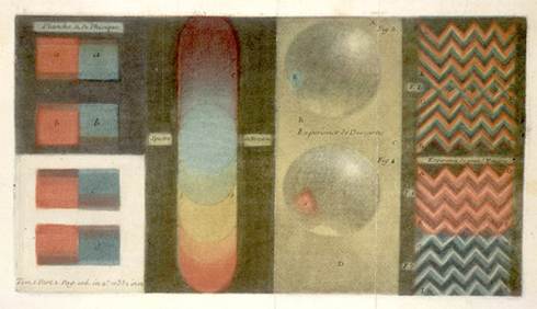
COLORlovers posts a nice history of the color wheel. Above is Gautier's attempt to illustrate gaps in Newton's Optiks (w/Newton's band of color in the center).

May 09, 2008

Obtrusive Design

psycho.gif

Roglok posts a handful of psychoactive wallpapers, animated GIF images that pretty much negate the idea of "wallpaper" as something that sits in the background. The one above is a just a static screenshot—imagine it flickering wildly. Or visit the site. (NSF, it probably goes without saying, epileptics.)

Welcome to my jazzy collection of Psychoactive Wallpapers.

My aim in this project is to generate static and animated .gif images with a low filesize that provide interesting visual effects.

I am inspired by the Structural Film movement of the 60's and 70's as well as stereographic 3d images and early webdesign..

Use these on your website and you could give even a MySpace page a run for the money in the Annoying Design Award.

[via Rhizome.org]

May 08, 2008

Flickr & Design Inspiration

Vandelay Website Design offers links by category of 99 Flickr Groups for Design Inspiration. Useful for those times (which is most of the time for many of us) when you're looking for new ideas to hack around with.

Web designers and graphic designers are always looking for new sources of design inspiration. Of course, many of us turn to CSS galleries, and there are even more sources of offline inspiration. Personally, I find the work in many Flickr groups to be another excellent source of inspiration. Aside from the billions of photos on Flickr, there are also some groups that have been established to showcase the work of designers. Here is a look at 99 of them according to category (about half of them are general graphic design groups). Below the link to each group you’ll see the number of members and the number of items (pictures, graphics, screenshots, etc.) that have been submitted to the group, plus I have included part of the group description as listed by the moderator.

[via xBlog: The visual thinking weblog | XPLANE]

May 01, 2008

Advanced CSS: Homer Simpson

Romàn Cortès uses a bunch of very elegant CSS code to draw Homer Simpson using only letters. Ned Bachelder added some additional code to animate the drawing, so that the characters are drawn on screen one character at a time. Impressive work.

I have to admit, I'd seen a link to this several times over the last few days and skipped it since I assumed it was just some ASCII art. It's not.

[via Daring Fireball]

April 25, 2008

Take That, Swan Lake

The Pixies as ballet.

[via Boing Boing]

April 23, 2008

Fonts and Politics

optima-runningmate.jpg

The NYT has another entry in the ask-designers-about-candidates'-graphic-identity articles, this time about McCain's use of Optima Bold. This article goes a little deeper because of its focus on a single candidate and just one element: font choice. Most designers quoted offer up a standard (sometimes conflicting) description of what Optima Bold means, Matthew Carter does a little more work to set that choice in context (including the image at the top of this post):

The moment of typographic truth will come when Senator McCain picks a vice presidential running mate and two names have to be combined on banners and bumper stickers. By choosing Optima, a rather distinctive typeface, he may have seriously limited his options.

I set the possible names in a bold weight of Optima caps and certain things became clear. HUCKABEE looks awkward in Optima, and ROMNEY is afflicted with the same difficult ‘EY’ combination that has plagued the current vice presidency. Perhaps because Optima is a German typeface, the word SCHWARZENEGGER looks predictably good.

Although it’s German, Optima took its inspiration from Quattrocento inscriptional lettering in the cathedrals of Florence and Siena, which may explain why GIULIANI looks so simpatico. In the end, however, my research suggests that the optimal running mate — so long as you don’t have to typeset her first name — is RICE.

I should add here that Optima is among my favorite fonts. Often criticized for being too middle of the road—a sans serif font that has suggestions of serifs, leading to charges of not being able to make up its mind—Optima works in most places (for me, at least) as being relatively neutral but still somewhat unconventional. Although obviously now all those meanings are going to get shifted around for me, given that every time I use it I'm going to feel like I'm backing McCain. (Posting that image above made me feel a little queasy.)

April 21, 2008

DJ Spooky Lecture on Remix Culture and Sampling

Hour and a half video of DJ Spooky on sampling, remix culture, copyright, and more (from a UNC-Chapel Hill talk).

[via Remix Theory]

April 18, 2008

Sweating the Details: Storyboard for The Shining

One frame of the Overlook Hotel from The Shining along with Kubrick's detailed storyboard for the shot, which includes (among other annotations),

In order to accurately get the
central path curve, you have to
set up the shots and put stakes
in the ground so that the curve
as seen through the ground
glass corresponds to what is
drawn. THERE IS NO OTHER WAY
TO DO IT REPEAT NO OTHER
WAY exercise the greatest
care as the compositional
effect of a different path might
be BAD BAD BAD

[via Daring Fireball]

April 17, 2008

Typography and Music: The Mountain Goats

The Mountain Goats' new video for Sax Rohmer #1 is a nice run (nearly literally) through hand-drawn type, aesthetics, and camera movement.

[via metafilter.com]

April 16, 2008

FontStruct

fontstruct.jpg

FontStruct offers a free, web-based font construction environment (with a grid and primitives) that outputs TrueType fonts to use on either Windows or Mac. There's also a gallery for sharing fonts created on the site.

Not high end, but probably a useful space for experimenting and teaching about type. (As you can probably tell, I haven't actually used it, but it's on that long, long list of Things I'll Work On After the Semester is Over, I Mean It This Time. Also, there's the fact that the userid and password I registered on the site aren't working yet.)

April 09, 2008

The Opening Shots Project

day-small.jpg

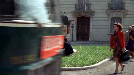
The Opening Shots Project collects analyses of opening shots from movies. Jim Emmer's list includes some basic theory and language for analysis, then offers a slew of analyses (including visual, audio, and thematic aspects), including Slackers, Altered States, Fight Club, Star Wars, and a few dozen more. Here's a small portion of the discussion of Day for Night (above):

A bus crosses the frame from left to right and we follow a woman in red walking from right to left, who stops to get a magazine. Notice the curves and circles that establish a pattern for the shot -- the curb, the kiosk, the fountain.

[update: Bonnie discusses some additional material (w/YouTube clips) from the opening Scenes of Lolita]

[via metafilter.com]

April 06, 2008

Documentaries and Cinematic Truth

Errol Morris' weblog post at NYT has some interesting discussion about the complex role of re-enactments in documentary film:

Critics argue that the use of re-enactments suggest a callous disregard on the part of a filmmaker for what is true. I don’t agree. Some re-enactments serve the truth, others subvert it. There is no mode of expression, no technique of production that will instantly produce truth or falsehood. There is no veritas lens – no lens that provides a “truthful” picture of events. There is cinéma vérité and kino pravda but no cinematic truth.

[via artblog]

April 04, 2008

net.art.zen

99rooms-small.jpg

Web Zen this week covers links to net.art sites, including 99Rooms.com (above).

March 26, 2008

Typewriter Fonts

typewriterfonts.jpg

Walker Art Center's weblog posts some scans from Typographica No. 6, an issue devoted to typewriter fonts (small chunk above).

Anyone who grew up using typewriters to write probably has, like me, both nostalgia and repressed horror: Typewriters developed character, like fingerprints, with each possessing its own quirks and identifiable characteristics (to the point that these characteristics showed up as plot devices in detective novels). But we don't lie to ourselves: They were a major pain in the ass.

[via kottke.org]

March 24, 2008

A Handpuppet Fish Reads Ginsberg's Howl

What more could you ask for in a title?

[via Boing Boing]

March 19, 2008

Sans Comic

sanscomic.gif

As part of an upcoming Dexter Sinister show, Cory Arcangel reset the 2008 Whitney Biennial's press release in Comic Sans. There's a full-size PDF available.

[via rhizome.org]

March 15, 2008

Data, Information, and Art

dumpster.jpg

Mitchell Whitelaw's "Art Against Information: Case Studies in Data Practice," in fibreculture No. 11 looks useful.

Data art involves a creative grappling with the nature of our now ubiquitous data systems. It draws data out, makes it explicit, literally provides it with an image. It also probes data's constitution, potential, and significance. In the process of working pragmatically with data — using it as a generative resource, a way of making — data art is involved in the culturally crucial figuration of data and its contemporary domain. This practice is a concrete exploration of what data is, does, and can do, but it also involves a set of assumptions, narratives and ontologies that construct data as an entity in the cultural imagination. That construction is at the core of this analysis.

The screenshot at top is from The Dumpster, "a portrait of romantic breakups collected from blogs in 2005," one of the pieces analyzed in Whitelaw's article.

Recently a cluster of works have appeared that deal with visualising networked society. Drawing on data from the new ‘social’ web, or blogosphere, they offer us a sense of the unimaginable crowd that now inhabits the network. The Dumpster (2006), by Golan Levin with Kamal Nigam and Jonathan Feinberg, is an interactive visualisation of teenage romantic breakups (Levin et al, 2006) (Figure 1). The artists harvested and classified some 20000 blog posts, analysing them to allow comparison; the work's interface follows the metaphor of the title, as hundreds of coloured circles, each representing a blogged breakup, drop from above and jostle each other. Browsing the breakups displays excerpts of the blog text, and alters the colours of the display to indicate the relative similarity of each breakup to the one currently selected. Sidebars to the interface provide more information on the selected breakup, including date, the gender and age of the author. The Dumpster is engaging and dynamic; simulated physics makes the breakup-circles jiggle and bounce; the interface is packed with detail, and the context-based display allows the user to investigate the multivariate relationships between breakups. As Manovich writes in his essay on the work, it encourages an interplay of attention between the individual and the group; ‘The particular and the general are presented simultaneously, without one being sacrificed to the other’ (Manovich, ‘Social Data Browsing).

[via serial consign - design / research]

March 11, 2008

Episode X: The TV Universe Implodes

tommy.gif

Crossoverman follows the logical implications of the final episode of St. Elsewhere, in which it's revealed that events of the entire hospital-based series actually took place inside the mind of twelve-year-old Tommy Westphall, an autistic character featured in the series. Given the wide range of other shows that featured crossover stories, scenes, or characters from St. Elsewhere--including Homicide, a series that itself crossed over into series including Law & Order and more than 280 others.

What's odd about this isn't the plot twist at the end of St. Elsewhere--which was interesting, but it is, after all, fiction—but the sheer number of interconnections one can track across such a larger number of shows (the above graphic from Crossoverman is only about 20% or less of the full map). The site also includes textual lists, a clip of that last scene, and more.

[via kottke.org]

March 07, 2008

City as videogame, city as text

Mirror's Edge, an XBox 360 game in development by DICE, involves a parkour courier named Faith, who is pursued by by agents as she runs the city attempting to deliver a package. As Greg Smith points out at Serial Consign, as with parkour in general, the videogame ends up reading the city as text.

What immediately caught my attention about these preliminary screenshots is manner in which architecture elements are demarcated. As per her training in "the art of displacement" Faith possess an innate ability for reading the geometry of her surroundings and this translates into a playing field where the objects, surfaces and assemblies that comprise the city are colour coded according to accessibility. When considered in this manner, the city becomes a giant text and, fittingly, play revolves around spatial problem solving and wayfinding rather than trigger finger virtuosity. [see my previous post Ways of Seeing Digital Space for more thoughts on provocative representations of space in gaming]

All of which maps to the larger cultural shift towards repurposing: cross-programming in architecture, remixes in music, collage in art, etc. Perhaps more importantly, once we accept that postmodernism (or whatever you want to call it) offers the possibility to read anything as a text (an advertisement, a building, a cultural movement), it's only a short hop to seizing the ability to rewrite those texts.

March 05, 2008

Tracking Leonard Cohen

Michael Bartel tracks the cultural history of Leonard Cohen's "Halleluja" from the 1984 original through Jeff Buckley's influential 1994 cover to Fall Out Boy's 2007 sampling. Includes charts of film/tv usage per year, covers vs. TV/radio usage, and more.

In twenty-five years, Leonard Cohen has gone from a punchline on a TV show [The Young Ones] to a sideways joke mixed with a tribute in Nirvana's "Pennyroyal Tea"--"give me a Leonard Cohen afterworld so I can sigh eternally"--to a totally serious starring role in a song by Fall Out Boy, a band not especially known for their irony. It seems like this has been accomplished by an emotional flattening--reducing a song about the varieties of grace to a mere lament. But this is not the only direction the song could have gone in. Something of Cohen's defiance, sensuality, and triumph could just as easily inform a cover.

Wikipedia has a less focused (although more link-filled) article on the song as well.

[via metafilter.com]

March 03, 2008

Rise of the VJ

Vague Terrain devotes issue 09 to the rise of the vj. Video interviews, discussions of synaesthesia, wallpaper vs. fine art, and strange things.

The energy behind the growing practice of audiovisual performance is intriguing; what is it that sparks the passions for creators and theorists working within this art form? The diversity of the concepts, techniques, and aesthetic qualities is remarkable, suggesting that this practice is not rooted in any one particular mindset, but instead, emerges from a wide range of trajectories that are converging within a contemporary form of media based performance art. However, live video mixing performances certainly address a hunger for immersive and synaesthetic sensory experiences where aural and visual elements work together to create a whole that is something beyond the sum of the parts. To experience the live performance of a talented VJ (or live cinema artist, if you prefer) alongside the talent of an innovative sound artist is a treat indeed; the senses are enveloped and the mind is tantalized into a world being spun into existence on the spot. Perhaps it is this feeling of immediacy and immersion that is so rewarding for performers and audiences alike. Perhaps it is the intense bombardment of the senses that does it. Or perhaps it is the richness of the dialogue between technology, spatial architecture, and human expression that speaks to us so powerfully.

[via serial consign - design / research]

March 02, 2008

"A seemingly random collection of sounds..."

Finalists for the 1st Ballardian Home Movies contest. You'll have to hit the site for the actual movies (YouTube), but here are some various quotes from judges on the winning entries (which, perhaps not surprisingly, sound exactly like what I might predict reviews of home movies based on JG Ballard would sound like):

A static shot, half composed of white, with red material intruding beneath. A seemingly random collection of sounds from talk radio or television are heard, slowly snatches emerge. Mopeds, a body found on a golf course. Murder on the roads, in the suburbs. “They shouldn’t be here,” claims a politician or letterwriter and as if to answer the listener appears to move away

Machine noise, loud and abrasive. A tool kit, saws, cutting tools. The slow reveal of a pile of Ballard titles leads you to wonder if here JG’s works are being recut, sliced, diced and served again. The Day of Creation is the final title to appear. The maker has taken Ballard and chopped him up.

This film chases its own tail, eventually disappearing into the black hole of inner space. Utterly beguiling.

CCTV-positioned footage of a seemingly empty street lined by lock-ups hiding ephemera, memory junk, yesterday’s crashes. Daylight as harsh as the artificial strip lighting. In a denial of creation we return to the water from which we emerged.

[via notes from somewhere bizzare]

March 01, 2008

Graphics & Journalism

NYT's Graphics Director Steve Deuenes answers readers questions about graphics and journalism. It's fairly nice overview (with many links and examples) of information graphics, the differences between static and interactive information graphics, and more.

February 24, 2008

The Evolution of Nintendo's Superheroes

The evolution of Nintendo characters (an implied history of videogame graphics, aesthetics, and aggression--it's difficult to look aggressive at 8-bit).

[via Gizmodo]

February 22, 2008

Writers on Screenwriting

MeFi posts an index to links to YouTube segments from the 1980s Writers on Screenwriting series. William Goldman, Neil Simon, Robert Towne, and more.

[via metafilter.com]

February 16, 2008

Architecture & Film: Eisenman and Haneke

ICONEYE transcribes a conversation between architect Peter Eisenman and filmmaker Michael Haneke:

Peter I’m interested in space without sound. In other words without meaning, without sound, just pure physical [makes a crunching noise]. Minimal, yeah, but it’s maximal minimal. My wife said that your interest in sound and my interest in space both deny the visual. That’s very good. We are both attempting to deny the visual. Because you’re not a visual person. Your films are filmic, but you don’t see anything happen. You don’t see anybody getting killed!

Michael To avoid the image of course means inciting your fantasy. Stimulating your fantasy.

Peter But you have to react. In an American horror film they go, “Boo!” and you go “Whoa!” But it’s stupid. I don’t think yours is horror, I think it’s terror. I felt terrorised by you. You’re using a visual medium to deny the visual – in an age when image is everything, where the eye is the dominant sense.

Michael It’s a result of the fact that I’m terrorised by the media. In a sort of way, it’s my defence.

[via serial consign - design / research]

February 11, 2008

Documentary: The Return of a Clockwork Orange

A FilmFour documentary/retrospective about Clockwork Orange, primarily interviews + film footage). (NSWF if you're offended ... OK, probably just NSFW for most of you.)

January 31, 2008

extend dendritic dynamics

The landscape urbanism bullshit generator constructs semi-random buzz phrases. Obviously satirical, but the output reminds me of Eno and Schmidt's Oblique Strategies for the theory set.

[via metafilter.com]

January 25, 2008

La Jetée ciné-roman

The book version of Chris Marker's remarkable Le Jetée is apparently coming back into print [spoiler warning—although for this movie, it's probably not an issue]. Marker's short movie, best-known probably as the inspiration for Gilliam's 12 Monkeys, makes 12 Monkeys and Memento look like Cat in the Hat. That complexity and indeterminacy is either a good thing or a bad thing, depending on how you look at it. (I side with the former.)

[via Ballardian]

January 18, 2008

web zen: desktop zen

kite.jpg

Web Zen this week covers desktop zen: Kaliber10000's On Display, a collection of screenshots of computer desktops from around the world (more than 4,000); Chickenhead's Desktop Bonanza, post- and post-post ironically retro desktop images in multiple resolutions; Pixelgirl Presents Desktop Images (including the above image, by Rocio Sánchez Beck); and several more.

January 15, 2008

Design Police: Visual Enforcement Kit

designpolice.gif

Design Police has constructed a Visual Enforcement Kit (a small portion of which is shown above) that you can download, print to sticker paper, and post use to deface objects that offend your design sensibilities.

I try to avoid using these things because they always end up sticking to me (both figuratively and literally).

[via Cool Hunting]

January 13, 2008

Game Designers' Workspaces

humble.jpg

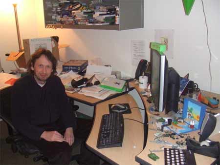
Kotaku has an extensive set of pictures of game designer's offices, including people at Sims Studio (Head Rod Humble above), Electronic Arts, Firaxis, Gearbox, and many more.

January 08, 2008

Michael Bierut Video Interview

TheAtlantic.com has a video interview with Michael Bierut.

I finished Bierut's Seventy-Nine Essays on Design about a month ago. I like any design book that includes significant discussion of falling off of exercise equipment. Other topics covered include, "I Hate ITC Garamond," the ClearRX pill bottle, Nabakov, paperclips, and the Homeland Security terror alert system. And manages to make sense of it all (or explain why it doesn't make sense).

[via kottke.org]

January 06, 2008

JG Ballard Pool at Flickr

There's an interesting JG Ballard Pool at Flickr.

Drained swinmming pools in suburban landscapes, gated communities with their security video surveillance, highway embankments, deserted airport concourses, the post industrial nightmare of the end of the western empire.

(Above is Lil Serenity's There By the Grace of Concrete Go I.)

I found this via Ballardian's two-part collection of Ballard-influenced art on the web, which ranges from sublime to frightening.

January 04, 2008

Data Cinema

sunset.jpg

Rhizome.org points to Carlo Zenni's "data cinema," a generative technique for creating movies from disparate media sources. Zenni's work includes eBay Landscape (stock market charts, CNN's homepage, and various landscapes) and (above) My Temporary Visiting Position From the Sunset Terrace (video of Ahlen, Germany crossed with Naples, Italy).

[via Rhizome.org]

December 27, 2007

2007 Logo Trends

logotrends.jpg

Logo Lounge discusses logo trends from 2007: helices, rubber bands, eco smart, urban vinyl, and more. Nice (both article and examples).

Above are from the urban vinyl section of the piece. From left to right, San Marko's design for webpublica, Innfusion Studio's for Infusor, Glitschka Studios' for Fire Squad, and Tactix Creative's for Cyclops.

[via kottke.org]

December 23, 2007

365 Days in the Life of a Desktop

chiat.jpg

Sean Nicholas Ohlenkamp at TBWA\Chiat\Day took a screenshot of his computer desktop every day for a full year, turned the images into a stop-action animation, added a jumpy soundtrack, and posted the video.

[via Monoscope]

December 21, 2007

Peter Sellers as Remixer

Peter Sellers reciting "A Hard Day's Night" in the style of Laurence Oliveir reciting "Now is the Winter of Our Discontent" [youtube]. From a 1964 TV program.

December 10, 2007

Mark Mothersbaugh/Mutato Muzik

LA Weekly has a piece on Mark Mothersbaugh's Mutato Muzik production company (w/extensive video/audio clips). Probably still best known for his work in Devo, Mothersbaugh's film, television, and ad scoring are easily as freaky as that earlier MTV-shaping efforts. The Pee-wee's Playhouse intro, both music and video, have to be among the best two seconds of television ever broadcast.

The iconic opening of Pee-wee’s Playhouse, which debuted in 1986, is a wondrous convergence of art and music, and is, even more so than Devo, what set Mothersbaugh on the path he’s on now. In two action-packed minutes, we’re introduced to Paul Reubens’ (quirky) comedic creation, an odd, subversive man-child; comic artist Gary Panter’s masterful (quirky) art direction, which manifests itself in prop-characters Chairry, Randy, Globey and Pterri; and Mark Mothersbaugh’s first (quirky) foray into scoring for a television series. Beginning with a riff on Martin Denny’s “Quiet Village,” the introduction kicks into gear with Mothersbaugh’s stomping theme song, which sounds like a futuristic synth-disco version of “Alexander’s Ragtime Band.” It exudes joy, and inspires Pee-wee to race around with pure glee, do some jerky rhythm-walking, spin and cackle, and go nutso, all while a sassy, Betty Boop–inspired Cyndi Lauper delivers marching orders: Get outta bed, there’ll be no more nappin’! (Wake up!)/’Cause you’ve landed in a place where anything can happen!

There's a lot of other things going on in the interview, including Mothersbaugh's (and other Mutato members') takes the death of record companies, videogames, and writing jingles:

From the start, continues Mothersbaugh, he and Casale were drawn to the Pop-art movement, inspired by Warhol, Rauschenberg and others who blurred the lines between commercialism and fine art — and by ad men who did the reverse. Specifically, one TV campaign struck him. He hums the melody to Pachelbel’s Canon in D, then sings the words to a Burger King commercial: “‘Hold the pickles, hold the lettuce, special orders don’t upset us.’ I loved that. Now that’s subversive. I thought, that’s amazing — to take such a beautiful piece of music and turn it into an ad for hamburgers. And then it got more interesting, because they then interpreted a country & western version, and a blues version, and a Dixieland version, and they totally went crazy on it.” That tuned his attention to television and radio commercials. “That was way more interesting to me than hippies or punks screaming for anarchy or revolution. I watched the hippies become commodified and turned into hip capitalists — and the punks, you just watched them kind of dwindle away.” Devo’s mission, decided Casale and Mothersbaugh, would be more subversive.

[via TapeOp Message Board]

December 04, 2007

Architectural Tetris

Full story and more video at Gizmodo.

November 29, 2007

A Life in Type

The Typophile Film Fest 4's opening credits. Very cool.

(If you haven't noticed, my personal rating system really only has two levels: "cool" and "very cool." I guess there's also a separate, corresponding set of negative ratings for "I'm not looking at you" and "I'm making fun of you." It's often difficult to tell if I'm using the positive set or the negative set.)

[via Monoscope]

November 27, 2007

Bent, Not Broken

Casey Clark's short (~10m) documentary on Chicago-area circuit bending. Cool.

November 24, 2007

Spam and Surrealism (The Comic Series)

Another Design Observer link: Tom Manning uses the chaff text in spam (those chunks of randomly grabbed, meaningless words inserted into spam email apparently to confuse spam filters) to create oddball, surrealist comics.

Every day for two and a half weeks this past spring, I decided to create a comic strip based on a spam text I received that day. My anonymous and presumably automated collaborators supplied the words. I figured out how those words might translate into a daily strip. The email subject line provided the title of the comic, and the author's name was that given by the spammer. The result is a modern kind of surrealism that is hard to imagine without the strange magic of today's technology. Enjoy.

[via Design Observer]

Understanding Decoration

At Design Observer, Stephen Heller challenges the Curse of the D Word.

Decoration is a marriage of forms (color, line, pattern, letter, picture) that does not overtly tell a story or convey a literal message, but serves to stimulate the senses. Paisley, herringbone or tartan patterns are decorative yet nonetheless elicit certain visceral responses. Ziggurat or sunburst designs on the façade of a building or the cover of a brochure spark a chord even when type is absent. Decorative and ornamental design elements are backdrops yet possess the power to draw attention, which ultimately prepares the audience to receive the message.

To a lot of people, Decoration is the opposite of Design or, at best, Decoration is hollowed out, soulless Design. Or maybe Decoration is design with a lowercase "d" instead of the serious uppercase. Which is actually often true: some of the worst designs are all decoration and no design: empty rhetoric. But it's not so easy to divide the two. Good design frequently involves decoration, and not simply as an afterthought. The "colorful palette and pictorial vibrancy" of Euro paper currency compared to US currency isn't merely decorative: it says something (something functional) about the Euro economy compared to the US economy. For that matter, US paper currency is elaborately decorated--the decoration is simply drawn from a different rhetorical register--socially conservative, purposefully less flamboyant. An insistent lack of decoration is itself a form of decoration—it's not like the US Mint can't afford to add more color or pictures, or that color or pictures are actually that much more expensive or time-consuming to develop. A conservative design/decoration choice, at least in cases like this, is every bit as elaborate and meaningful as a flamboyant design/decoration choice. (In other words, there's no such thing as empty rhetoric.)

November 22, 2007

Industrial Design Process: Frog Design & Seagate FreeAgent

id-ci.jpg

Wired has a (fairly quick) overview of the ID process Frog Design used when hired to help develop Seagate's FreeAgent external drive. Not a lot new new here if you've done anything in ID (or even read much about it), but this would be useful overview of industrial design for students, starting with contextual inquiries through CAD and rapid prototyping to production.

Note: I was halfway through skimming the article the first time through when I realized that I already own several of these drives—and I have to admit, at least part of my decision was the design. They do look kind of cool.

November 19, 2007

Design School: The Primary Years

kbd-sketch.jpg

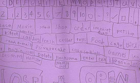
Amy Tieman at c|net noticed a group of schoolkids who were drafting paper prototypes of laptop computers.

A group of kids from one of our local elementary schools has formed a "mini-laptop club." They don't use electronic machines. Instead, these first-, second- and third-graders draw their own laptops on construction paper and pretend to e-mail each other. They dedicate a surprising amount of time to this activity. I once had a chance to examine one of their "keyboards." I was fascinated to learn which Internet functions had sunk into the minds of these kids, who are just getting their first exposure to computers from watching their parents work, and from using kid-friendly sites.

Additional images and photos available at an interview with Tieman at The Morning News.

November 18, 2007

Museum of Forgotten Art Supplies

skum-x.jpg

I'm doing a tab sweep in NetNewsWire Pro to winnow out things I've flagged from RSS feeds during the last three weeks, so I can't be sure where I found the link to this. But Drawger's Museum of Forgotten Art Supplies is worth a look if you (a) long for the days of rubber cement, eraser shields, and Skum-X (above), or (b) if you want to know why a lot of graphic artists were so eager to move to computers. For me, it's both contradictory impulses. Don Norman talked about this in Emotional Design:

I opened the box. Inside was a gleaming stainless-steel set of old mechanical drawing instruments: dividers, compasses, extension arms for the compasses, and assortment of points, lead holders, and pens that could be fitted onto the dividers and compasses. All that was missing was the T square, the triangles, and the table. And the ink, the black India ink.

"Lovely," I said. "Those were the good old days, when we drew by hand, not by computer."

Our eyes misted as we fondled the metal pieces.

"But you know," I went on, "I hated it. My tools always slipped, the point moved before I could finish the circle, and the India ink—ugh, the India ink—it always blotted before I could finish a diagram."

I don't think computers necessarily improve drawing ( or art or writing or anything, for that matter), but "progress" is always that thing you can never reverse: old art supplies are only now usable to us as brief nostalgia pieces, not simple, everyday, functioning objects. I still use a fountain pen, but I can only do so within the overriding sense that it's retro.

November 17, 2007

Wu-Tang Clan's RZA Breaks Down His Kung Fu Samples by Film and Song

At Wired, RZA sources the Kung Fu samples used in Wu-Tang songs (w/extensive audio clips.)

Photo Retouching in History

Hany Farid at Dartmouth has an extensively illustrated page of photo retouching samples from 1860 to present: Lincoln's head composited onto John Calhoun's body, Matthew Brady's picture of General Sherman and his generals (with one general added to the original photo to complete things), Mao removing images of persons officially out of favor with the gov't, the National Geographic's altering of the Great Pyramids of Giza to fit them into the cover's aspect ratio pleasingly, and more.

[via Kottke and Boing Boing ]

November 09, 2007

Circuit Bending Challenge Winners

GetLoFi has the top three picks from their recent one-day circuit-bending challenge. Above is Squelchbox's YouTube clip of the process (and results) of his work on a Talk and Learn. Strange. In a good sort of way. The other two picks also have YouTube clips at the GetLoFi post.

[via GetLoFi ]

November 07, 2007

Jim O'Rourke & Tenori-On

Yamaha's website has a video of Jim O'Rourke getting a tutorial on how to use a Tenori-on, that 16x16 procedural music/lightshow/Simon-on-amphetamines thing. Like everyone else who has seen a demo, I want one. (Insert somewhat clichéd theory here about the Tenori-on being a symbol-virus.)

[via Rhizome.org]

Architecture and Ethics: Noblesse Oblige

Lebbeus Woods' weblog has the first post in a series on architecture and ethics. Noblesse Oblige is a short analysis of the Seagram Building and and the construction/maintenance of class difference:

To the average passerby, the building and its siting have the aesthetics of a civic monument, an architecture that goes far beyond advertising its client, and becomes a kind of gift to the city, a form of nobiisse oblige—the obligation the rich and powerful have to the society that made them so—that confirms their superior station. The Seagram Company assumes the aesthetic raiments of government, bestowing on the public space of the street an imposing demonstration of social hierarchy and the ethical relationships of New York’s social classes.

[via LEBBEUS WOODS]

November 03, 2007

Database as Love Letter

Paul Ford at The Morning News responds to this reader request,

Question: I need 100 ways to say “I love you” to my girlfriend. We made a bet last night that I couldn’t come up with 100 and I can’t lose! Help me pa-pa-pa-pa-please non-expert. —Rod

with a sprawling (and sort of flailing, in a funny way) collage of text, video, and still image. (Is that a database? Sure. A pretty simple one, but in terms of demonstrating writing as database rather than linear narrative, it's suggestive.)

[via Ftrain.com]

Pac-Man Meets Zork

Pac-Txt.

You awaken in a large complex, slightly disoriented. Glowing dots hover mouth level near you in every direction. Off in the distance you hear the faint howling of what you can only imagine must be some sort of ghost or several ghosts.

[via Super Colossal]

November 02, 2007

Architectural, Criticism, Media, Recursion

au.jpg

Someone (apparently nearly everyone, if Google is to be believed) said that writing about music is like dancing about architecture. Criticism, though, is at its best precisely because it's oddly recursive: about something both figuratively and nearly literally: dancing around the subject as a way to understand the subject, the leaky permeability of its boundaries. Criticism, when it's useful, affects both how we understand something as well as how that "something" is and is done. Writing about music can change how we understand music and, often, how we make music.

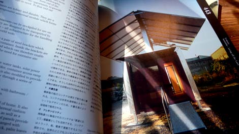
Which is a long way [footnote 1] of getting to point at this article in cityofsound about a the August 2007 issue of the Japanese periodical Architecture and Urbanism dealing with Australian architecture. What interested me wasn't so much the topic of Australian architecture (although that was interesting), but cityofsound's critical essay on this particular issue of the AU, which deals simultaneously with the issues contents and the form of the magazine itself (see above).

I snap out of this glorious sun-drenched dream when I recall an old copy of The Architectural Review from 1970 (No. 884 October 1970, picked up for a fiver at Margaret Howell). That issue featured an 'Australian Newsletter' by its legendary editor J.M. Richards (see bottom of article for the full scanned pages). Despite best intentions, the article is suffused with a snobbish demeanor and insularity that would probably have driven any self-respecting Australian architect mad, cultural cringe or not.

And writing about architecture, like architecture itself, is fundamentally about the play of and within symbol systems. And here is where "architecture" splits from "building": what buildings mean to us, as viewers and as inhabitants, grows out of both how we use them and how we think about them. So architectural criticism, like music criticism, like criticism in general, are parts of their objects of critique. There's always recursion and slippage, and that's a good thing. Il n'y a pas de hors-texte.

[footnote 1] Made even longer by the fact that my system crashed in the middle of writing this, and I think I've lost the thread a little here. But I'm posting it anyway so I remember to come back to this later, even if I can't quite figure out what I was going after when I started. Wish you'd read this footnote midstream instead of after you'd slogged your way to the end, don't you? Sorry.

[via things magazine]

October 28, 2007

And Another on Type (w/Interviews)

Features interviews with Steven Heller, Jonathan Hoefler, and Tobias Frere-Jones.

[via kottke.org]

What is Typography?

Nice short movie that covers basic features of typography. Primarily short definitions of key terms, but still interesting.

[via information aesthetics]

October 26, 2007

Using the Structure of Games to Design Better Web Apps

Dan Saffer's presentation from Voices That Matter 2007, Gaming the Web, advocates using game theory and practice to structure application design of all types (including Flickr as game).

[via O Danny Boy]

Vectors: Journal of Culture and Technology in a Dynamic Vernacular

bv.jpg

Vectors new issue covers/explores/interrogates/demonstrates Difference:

Many writing on new technology in the mid 1990s commented on the parallels between the ways of knowing modeled in computer culture and in theories of poststructuralism. Meanwhile, critical race and postcolonial scholars have highlighted how certain tendencies within poststructuralist theory simultaneously respond to and marginalize blackness. This maneuver may at least partially be possible because of a parallel and increasing dispersion of electronic forms across culture, forms which simultaneously enact and shape these new modes of thinking. Certain modes of racial visibility and knowing coincide or dovetail with specific technologies of vision: if the electronic underwrites today's key modes of vision and is a central technology in post-World War II America, these technologized ways of seeing and knowing took shape in a world also struggling with shifting knowledges and representations of race.

The pieces are experimental, interactive essays on postmodern archiving practice (a self-reflective experiment), annotated video of Iraq and Afghanistan combat, distributed culture, and more. Very interesting takes on interface design for academic discourse as well. The screenshot above is from David Theo Goldberg and Stefka Hristova's "Blue Velvet: Re-Dressing New Orleans in Katrina's Wake," an interactive multimedia space for exploring race, capitalism, and reconstruction in New Orleans.

[via serial consign - design / research]

October 17, 2007

Lo-fi: Speakerphone

Either a very well executed spoof or postmodern hi-fi (which means, possibly both and more): Speakerphone provides heavily tweakable emulations of low-fidelity speakers (including "Fedtro Megaphone," "Ampeg B18 in a bedroom," "Crackling Walkie Talkie," and [cool!] "Mac SE").

A bad GSM connection on a busy sidewalk, a bullhorn with feedback and a helicopter overhead, or a 1952 rockabilly guitar amp in a recording studio live room: Speakerphone gives you authentic speakers of any size together with their natural environments.

All the walkie-talkies, distant transistor radios, Guitar cabinets, upstairs TV sets, bullhorns and cell phones you'll ever need. Speakerphone will add dial tones, operators and static, and you can select from a wealth of ambiences on either the caller or receiver's end. And with a click you can send anything from the sample-playback bay right to the cursor in your Pro Tools track.

The product page includes audio and video demonstrations of the software in use with ProTools. (I'm digging around now to see if there's a Tom Waits module.)

[via KVR Audio]

October 14, 2007

Newer Work: Sculpture and Sound

sculpture and sound

maddscientist39110's sculptures involving circuit-bent audio at Flickr. (No audio available, unfortunately. But they look cool.)

[via TapeOp Message Boards]

Type Pedagogy

My week has sort of been like this. (NSFW if your co-workers can read and don't have a sense of humor.) Perhaps not surprisingly, the RSS feed I pulled that from was pointing to something else: The first cell of this PDF from BanComicSans.com..

[via Design Observer: Main Posts]

October 13, 2007

Janice Caswell: Memory Landscape

caswell.jpg

Janice Caswell's work (wall drawings, works on paper) follows people's memories of movement through geographies:

My drawings and installations represent mental maps, an investigation of the mind's peculiar ways of organizing memories. I attempt to trace the edges of recalled experience, plotting the movement of bodies and consciousness through time and space.

[via information aesthetics]

Deconstructivist Architecture (Real and Symbolic)

things magazine, a place I normally crib individual links from, has an interesting (link-filled) post, We Can Never Look at Fractured Facades, on the 1970 Greenwich Village Explosion (a Weatherman bomb factory accident), MoMA's 1988, Daniel Libeskind, and the contradictory symbolism of appreciating/fearing/commemorating deconstructivist architecture.

[via things magazine]

October 12, 2007

Typography School

Omair Barkatulla's short film Typography School, from the London College of Printing, argues that traditional letterpress techniques can provide a better foundation for understanding type than computers. Printer/teacher David Dabner says, "Computers make students sloppy. It makes for sloppy thinking. It make for sloppy thinking ... a sloppy approach. Good typographers can think. If you can't think, you produce a lot of nonsense."

Arguable, but Dabner has a good point: Ease of use does not always (or even often) translate into better learning. Sometimes it's crucial to step back and slow down, to do something manual that tends towards enforced reflection rather than easy (and oversimplified) gratification. You can see a similar feeling expressed in the number of relatively geeky people who use Moleskine notebooks and fountain pens (me included): communication media are never neutral ecologies. They structure our interactions in differing, sometimes extremely powerful ways.

[via IxDA Discussion List]

Dylan's Competition for "Worst Interview Subject"

NPR's website hosts the video of their recent Sigur Ros interview, which even the hosts describe as "possibly the worst interview in the history of electronic media." And they have the video to prove it. (NPR claims they still love Sigur Ros, but advise you to "never invite them on your radio show.")

[via metafilter]

October 11, 2007

Magnetic Migration Music

Found/made audio objects: Magnetic Migration Music collects fragments of found audio tape from city streets in London and other locations, short impromptu interviews, and other audio ephemera. Sort of difficult to describe (even after having read the website and listened to sample assemblages), but interesting.

Have you noticed that there are fragments of audiotape flapping in the wind?

Strands can be found all over the world, in gutters, snagged on trees, wherever tape players have ventured it seems they have chewed, snarled and spat too.

These fragments create a shifting inaudible soundscape. Some of the strands have travelled far, they are worn and battered but can be re-spooled, and listened to.

[via things magazine]

October 08, 2007

And Ballard Reads Gehry

At the Guardian, JG Ballard interprets Frank Gehry's Bilbao Guggenheim:

The one thing that someone visiting the Bilbao Guggenheim can forget about is any thought of actually entering the building. Stay outside it, at a distance of about one hundred yards, and you will absorb all its audacity, magic, good humour and genius. And its infantilising charm. This is Disneyland for the media studies PhD.

[via Ballardian]

Theroux Reads Borges

This is one of those posts where I try to come up with something witty or interesting to add, but fail, and end up just posting the full text of someone else's blog post that points to yet a third, "original" post (itself a link to an audio commentary in which one author reads a text written by another author and discusses it with a third person).

Theroux reads Borges: "Paul Theroux reads Jorge Luis Borges’s short story The Gospel According To Mark and discusses Borges with The New Yorker’s fiction editor, Deborah Treisman. mp3"

[via metafilter.com]

Do Not Adjust Your Set

On the Way Out

October 02, 2007

Design and Unlearning

To design means forcing ourselves to unlearn what we believe we already know, patiently to take apart the mechanisms behind our reflexes and to acknowledge the mystery and stupefying complexity of everyday gestures like switching off a light or turning on a tap.

- Alain de Botton, The Architecture of Happiness, p. 247

October 01, 2007

Isolated Building Studies

David Schalliol's Isolated Building Studies (a Flickr set) documents (you guessed it) isolated buildings in urban Chicago: homes, churches, storefronts in the absence of any surrounding structures.

Initially, viewers may see the buildings in this set as identical, but the novel, consistent context shows these buildings as symbols of communities in flux. Whether a building is a pioneer or a survivor, built by gentrification or decayed by divestment, these buildings and their environs demonstrate how investment cycles affect the visible differences and similarities in our built environment, urban community and community relationships.

September 29, 2007

Walkman Mellotron

Brent Pettis and Eric Beug to construct a Mellotron with four used Walkman tape players (video covers theory + techniques for building).

[via MAKE]

September 26, 2007

Read/Write/Remix: Eduardo Navas Interview

Eduardo Navas, of Remix Theory, is interviewed at Serial Consign. Interesting.

[Click-through for the interview.]

And I do tend to organize my books like records. In a way, given my priority in writing these days, books are all over the place, while my records sit neatly in milk crates and against the wall. I actually only have a few of my records with me, most of them are in storage at the moment, and I pull them out as I need them according to what I’m researching. So, if you were to look at my place, you would see chaos, but I know exactly where the books are, and when I don’t find them where I left them (sometimes under three or four others) I freak out! If people were to see them they would not really get the system. Also, obviously, I have CDs and these are usually all over the place because I listen to them all the time. No system here, but whenever I have friends over, I’m able to discuss music and find stuff immediately. And of course there’s the mp3s. My ipod is crucial for me. Very convenient, but there’s something about not seeing an object, only a name on the screen when experiencing music this way.

But I think that this is common for anyone writing a term paper, master thesis or a dissertation. You end up living with books day in and day out. They become your friends and you know where you left them. I don’t have a specific archiving system. I usually arrange them by subject or a current argument I’m working on, in no particular order; often times, I arrange the books according to size and place them on the shelf according to how they visually complement other books. I really don’t think this is that special, and suspect that I share this tendency with the masses when it comes to making a mess of my books. Just about everyone has an idiosyncratic system for organizing collections. Especially now that we live with archives day in and day out.

[via Rhizome.org]

September 25, 2007

Music and Amnesia

At The New Yorker, Oliver Sacks discusses the case of Clive Wearing, a musician whose developing amnesia left him with only a few seconds worth of memory:

Desperate to hold on to something, to gain some purchase, Clive started to keep a journal, first on scraps of paper, then in a notebook. But his journal entries consisted, essentially, of the statements “I am awake” or “I am conscious,” entered again and again every few minutes. He would write: “2:10 P.M: This time properly awake. . . . 2:14 P.M: this time finally awake. . . . 2:35 P.M: this time completely awake,” along with negations of these statements: “At 9:40 P.M. I awoke for the first time, despite my previous claims.” This in turn was crossed out, followed by “I was fully conscious at 10:35 P.M., and awake for the first time in many, many weeks.” This in turn was cancelled out by the next entry.

Which looks alarmingly like my own notebooks.

[via Your Daily Awesome]

On Beyond ASCII

The ConScript Unicode Registry hosts the Seussian Latin Extensions: U=E630 - U=E64F:

The Seuss script is an extension of the Latin alphabet, proposed by Dr Seuss (Theodor Geisel) in his children's book On Beyond Zebra (New York: Random House, 1955; ISBN 0-394-80084-2). The letter names are those used in the List of Letters appearing in the back of the book, which lacks folios (page numbers), except for U+E643, which is not given a name, but is named for its constituent glyphs, as it appears to be a ligature.

seuss-unicode.gif

[via Boing Boing]

September 18, 2007

Fenceland

Subtopia (subtitled "A Field Guide to Military Urbanism") posts a lengthy discussion (with pictures) of barricade-as-event at the recent G8 Summit:

So, even though neither you or I were there to stroll around the eerie evacuated streets, past the streamers of lightweight warnings and flexible blockades, or what we might call a temporary new aged market place of geopolitical medievalism, a few of our fellow bloggerades hunkered there down under did a more than brilliant job of covering this Subtopian escapade.

[via Super Colossal]

September 11, 2007

Philosophy and Architecture

Ludwig Wittgenstein, having abandoned academia for three years in order to construct a house for his sister Gretl in Vienna, understood the magnitude of this challenge. "You think philosophy is difficult," observed the author of the Tractatus Logico-Philosophicus, "but I tell you, it is nothing compared to the difficulty of being a good architect."

- Alain de Botton, The Architecture of Happiness

September 08, 2007

Design the copywriter's birthday card. They said.

A graphic designer makes a birthday card for a writer. Grudgingly.

[The comments section has some great material in it as well, especially the writer's card for the graphic designer.]

[via Noisy Decent Graphics]

Variations: Graphic Design Courses

Jessica Halfand does a quick survey of graphic design courses. The variation is interesting, both for its range of types of institution (from junior high through college) and the variation in approach (at every level). But what I liked was the triggering event for her article, her twelve-year-old son's decision to take a graphic design course:

I think his choice may have been inspired by the smart-alecky tendencies that befall many children of graphic designers: that is, he fantasizes that he will unsettle his teacher by impressing the class with his rarified knowledge of hanging punctuation, oldstyle figures and ligatures. ("If the teacher tells us to use Comic Sans," he whined, "I'll just lose it.")

[via Design Observer: Main Posts]

September 03, 2007

Pecha-Kucha: 20 Slides in 400 Seconds

Daniel Pink at Wired discusses (and demonstrates) Phecha-Kucha, a performance-art/presentation technique that involves 20 slides each displayed for 20 seconds (640 seconds total). Although invented by two Tokyo architects as more of a performance and competition, the whole thing cries out to be made a rule the majority of slide-based presentations.

People slam PowerPoint as if it were some irresistible force that turned the most eloquent speaker into a droning bore. But while PowerPoint certainly creates a framework for presentations that can easily become boring, I can't see any real correlation between "Boring Talks" and "PowerPoint" in my experience. I've seen a huge number of boring talks using PowerPoint, but also a much huger number of boring talks using 35 mm slide projectors, chalk boards, whiteboards, and just idiots flapping their arms around. (Invariably, in fact, I'm that idiot.) But I'm all in favor of people trying to do something interesting with their time, even if it's just imposing a new framework like Pecha-Kucha on their presentations.

Pink's demo at YouTube, btw, is a great discursion on how signs work.

[via Wired]

August 28, 2007

Endangered Machinery

inside.jpg

Endangered Machinery: The Industrial and Industrial Heritage Photography of Haiko Hebig. Very cool. (Above is from his 12.24.06 entry, "Calmness.")

[via Monoscope]

August 26, 2007

4th International Circuit Bending Festival Video

YouTube clips from the 2007 Bent Festival are now online. (Above is a performance by Gunung Sari. This Loud Objects, on-the-fly wires demo is great as well.)

[via bendersanonymous]

August 24, 2007

The Journal of Aesthetics & Protest

Issue 5 is now online:

Arguably, today the act of social networking is commodified more visibly and materially than ever before…This commodification shoudn't hinder us to work in relationship to one another and in a social and political context. Social memory with a sense of history and political demands seems to have undergone an accelerated and profound erasure. This rapid memory loss is facilitated by media consolidation and the plundering of public education programs to fund global mercenary actions.

Eclectic and dense (in a good sort of way). Here's a bit from Stevphen Shukaitis' "Affective Composition and Aesthetics: On Dissolving the Audience and Facilitating the Mob":

The concept of affective composition is formed by bringing together notions of affect with the autonomist notion of class composition. The concept of affect has been developed in a submerged history of philosophy stretching from Spinoza to Gilles Deleuze and Félix Guattari (and further developed by such thinkers as Antonio Negri and Genevieve Lloyd) to indicate an increased capacity to affect or to be affected by the world. For Deleuze and Guattari, artistic creation is the domain of affective resonance, where imagination shifts through the interacting bodies. Composition is used here, borrowing from the autonomist Marxist notion of class composition, to indicate the autonomous and collective capacities to change the world through social resistance. As forms of collective capacity and self-organization are increased, strengthened by the circulation of struggles and ideas, the capitalist state attempts to find ways to disperse them or to appropriate these social energies for their own workings. Thus the cycles of the composition, decomposition, and re-composition of struggles are formed. A key insight of autonomist thought is the argument that the struggle itself and the forms of social cooperation it engenders determine the direction of capitalist development. To consider affective composition by examining street or performance art is to examine the capacities they create, and how they contribute to the development of forms of self-organization; this is what the Infernal Noise Brigade describes as “facilitat[ing] the self-actualization of the mob.”

[via Rhizome.org]

History of the Discovery of Cinematography

Extensive and illustrated: The History of The Discovery of Cinematography (900 BC to Muybridge and Chaplin).

[via metafilter.com]

August 18, 2007

Unsustainable Design

Noisy Decent graphics uses the modern evolution of shaving technologies as a metaphor for de-evolution in design:

I think this example is a metaphor for how marketing departments and brands and designers have managed to make stuff worse using design. And not just worse, but we've actually come full circle and designed a solution that's the complete opposite of the answer.

Some technologies inherently take shuffling, awkward steps toward increased quality: consumer digital cameras, for example, traded image quality for convenience and gained widespread adoption. Eventually, the quality of digital images has increased to the point that the general user (unfortunately, some would say) isn't aware of the lower quality of most digital images compared to film cameras. And then there's the whole issue of what "quality": Sometimes noise in the system is preferable to higher fidelity (despite having several thousand dollars worth of photography gear, some of my favorite images are still those wonky, essentially damaged Holga shots—taken with a $20, plastic lens, 120-format camera).

But design, as NDG points out, often throws out the whole issue of quality (by whatever metric) in favor of simple, increased consumption.

[via Noisy Decent Graphics]

August 17, 2007

A Screaming Came (Very Slowly) Across the Sky

According to the Mercury News, for the last year a set of four, rotating LED wheels atop Adobe tower in San Jose have been sending out a semaphore version of Thomas Pynchon's, The Crying of Lot 49.

[via Boing Boing]

August 16, 2007

"Result of Expressing my Obnoxious Views"

views.jpg

University of Illinois' Digitized Book of the Week is The Prisoner's Hidden Life: Or, Insane Asylums Unveiled: As Demonstrated By The Report of the Investigating Committee of the Legislature of Illinois, Together With Mrs. Packard's Coadjutor's Testimony, documenting a woman's 1860 - 1863 incarceration in a mental institution for expressing "dangerous" religious views.

Harrowing story, although to be honest what caught my eye was the title of the chapter in the scan above.

[via things magazine]

Sub-Memory Check

roulier.jpg

Michael Roulier's Sub-Memory Check randomizes video clips and audio. Creepy, in a peaceful sort of way.

This film situates itself between sub-urbanity and sub-terranity, leading us from the gray dust of decomposition towards air and ozone.

(At Roulier's main site, after you click through the Flash intro, link to this piece is at the bottom left.)

[via LensCulture Web Log]

Squelchbox

(More Squelchbox on YouTube; Squelchbox home.)

[via Benders Anonymous]

August 14, 2007

Ranting at Buildings

Icon's Fiftieth issue covers the rise and fall (and rise and fall and rise) of the manifesto. Includes 50 manifestos from architects and organizations, including pithy missives by Peter Eisenman, Urban Think Tank, Bruce Mau, Zaha Hadid (who provided a sketch), and (if my math and Icon's claim are correct) 46 more. Here's Greg Lynn's:

Organic design is not just a style. Design, architecture and life will continue to become more and more biological, not merely biomorphic. I look forward to the software that lets us design not just the shape but also the growth and behaviour of animate matter. Designers and architects will continue to proliferate as there is more and more need for design, as we get access to more matter through genetic and biological innovations.

And a part of Peter Eiseman's short Debordian reminder:

Where is architecture’s critical resistance to this process of loss? The crisis of the spectacular demands a call for a new subjectivity, for a subject removed from the passivity induced by the image and engaged by form in close reading.

[via anArchitecture]

August 13, 2007

Leonardo Issue on Locative Media

The latest issue of Leonardo focuses on locative media. Quite a few worthwhile articles, including Leslie Sharp's "Swimming in the Grey Zones: Locating the Other Spaces in Mobile Art." Sharp discusses, among other things, a couple of ghost narratives she's working on:

The 'ghost' is one of those liminal forms that raises questions about embodiment and subjectivity and has a peculiar affinity to being picked up by the machines of technology. In the project for the Cheonggyecheon in Seoul, I am creating four separate narratives using night-vision and other footage shot on location in Seoul. In the narrative, the ghost is dug up by well-intentioned development, stirring up memories of place, colonization, and a Brechtian world of grey markets and grey activity. This ghost also inhabits streams – streams that flow down from the mountains and streams of data, searching for places to rest or to haunt, looking for things to play with and taunt. In particular, this ghost longs to haunt our devices of transmission, to produce in these devices an abject space that is uncomfortably close to our bodies. Ghosts are often mischievous; here the ghost also wants to play with errors of signal inaccuracy produced by satellites (usually compensated for by differential error cancellation in GPS), or to get the user to confuse the GPS to produce moments of dis-location.

The ghost itself is always an abject thing – signifying the cast off and suffering. This abjection can spill into the form or space it inhabits, creating a new monstrous space. I have written elsewhere about data space as a new monstrous [16]; in the case of the ghost, the monstrous is conjured by machines of vision and sound and varies according to the nature or properties of transmission: spirit photographs of the nineteenth century, or early telephones and radio seen as the 'devil’s instruments', recent technologies such as night-vision cameras that detect the undetectable, or technologies of transmission that transfer the formless as data and signals.

[via Rhizome.org]

August 10, 2007

Synthesized Zen

buddha.jpg

Web Zen's weekly post covers odd synths, including a collection of various Texas Instruments Speak & Spell variants, circuit bending, a library of cellphone ring tones, and the eerie and mythical Buddha Machine (above). Bent Sounds hacked toy electronics rocks; be sure to listen to the mp3s.

July 30, 2007

Found Objects: Square America

terrors.jpg

Square America is a found photography site compiled by one person. One weird (in a good sort of way) person. This is one of those sites that you can lose an hour or two in, without having accomplished anything particularly productive. And I mean that in a good sort of way. (Above is from SA's "Pleasures and Terrors of Youth" collection.)

Square America is a site dedicated to preserving and displaying vintage snapshots from the first 3/4s of the 20th Century. Not only do these photographs contain a wealth of primary source information on how life was lived they also constitute a shadow history of photography, one too often ignored by museums and art galleries. Or at least that's what I tell people- more accurately, the site is a catalog of my obsession with vintage photographs. For the last eight years or so I've spent countless hours digging through boxes of old snapshots at flea markets (mostly here in Chicago and in NYC) and too much money buying photos on eBay. The site is my attempt to create some kind of organizational framework, however idiosyncratic, for the sprawling mess my collecting has created. More importantly, now that the site is up I can tell people that I'm a curator rather than a collector.

Other collections include "The Book of Sleep," "Defaced," "The Road," and many more.

[via things magazine]

July 25, 2007

The Twelve Kinds of Ads

At Slate, Seth Stevenson overviews Donald Gunn's (1978) on the twelve common kinds of ads: Demo, Show the Need/Problem, Comparison, Unique Personality Property, and more. Stevenson's piece is available as either slideshow (w/embedded YouTube exampels) or a full video feature.

In 1978, Donald Gunn was a creative director for the advertising agency Leo Burnett. Though his position implied expertise, Gunn felt he was often just throwing darts—relying on inspiration and luck (instead of proven formulas) to make great ads. So, he decided to inject some analytical rigor into the process: He took a yearlong sabbatical, studied the best TV ads he could find, and looked for elemental patterns.

[via Fimoculous.com]

July 20, 2007

Interactive Architecture: Performative Ecologies

performative.jpg

Ruairi Glynn's Performative Ecologies project involves light, motion, and computation in an environment that watches and responds to motion in the environment. (Several video demonstrations are available at Glynn's site.)

Rather than pre-choreograph the actions of an interactive architecture, Performative Ecologies explores the role of the architect as a designer and builder of frameworks, rather than predefined events, in which responsive adaptive environments are able to not just react, but also propose. Often, through trial and error, these environments can suggest new gestural and spatial interactions and evolve their own expressive qualities while negotiating these actions with human inhabitants and other architectural systems.

Spaces and installations like this suggest what composition—writing—might become in the age of databases. Writers tending more toward design of interaction than creation of static, monolithic objects, creating a space for dynamic movement. We've had, of course, hypertext for several decades, which is a start. Dynamic features like those available in early incarnations such as HyperCard and Storyspace and later things like Flash (or any of the programmable text environments like Tinderbox, Processing, etc.) have been woefully underutilized by most writers. What will it mean when text ceases being simply an external object—at best, a pushbutton gizmo—and becomes distributed within spaces around us, responding to us?

At what point does a text cease to be like a text? When it's interactive? When it's spatial? When it's database-driven or pseudo-random? And why?

[via Interactive Architecture dot Org]

July 16, 2007

David Foster Wallace

I like David Foster Wallace's work, but mostly liked the title of the link that Fimoculous gave to the YouTube clip: David Foster Wallace speaking at an Italian conference and looking like Axl Rose (mainly, I guess, shorthand for long hair, scruffy beard, and bandana).

[via Fimoculous.com]

July 15, 2007

Photosynth Demo

Cool TED demo of Microsoft's Photosynth, which analyzes an existing collection of photos of a place, then constructs a navigable 3D space based on the multiple views. The 3D representation can then share information (such as tags) back and forth with the source photos. The image spaces scale very well, allowing users to scale back to view arrangements of thousands of pictures or in to view details of very small portions. MS has a demo version and background info here.

[via Aesthe/tech:tonik]

July 13, 2007

Walking the Hypertext

mission.jpg

The Mission Stencil Story (Flickr photos here) makes space for a choose-your-own-adventure story using stencil graffiti on sidewalks (making literal the idea of a reader's "path" through a text).

The mission stencil story is an interactive, choose-your-own-adventure story that takes place on the sidewalks of the Mission district in San Francisco. It is told in a new medium of storytelling that uses spraypainted stencils connected to each other by arrows. The streetscape is used as sort of an illustration to accompany each piece of text.

Its a love story with 2 characters who start in different locations. His story starts at 16th and Valencia, in front of the Crown Hotel / Limon Restaurant with the text "He Leaves his Lonely Apartment." Her story starts at 21st and Guerrero in front of a stunning mansion with the text, "She Leaves her Lonely Apartment." Eventually their paths merge, at the point where they meet, and their paths travel together until drama pulls them apart.

[via metafilter.com]

July 04, 2007

Walter Murch on BLDGBLOG

BLDGBLOG publishes an interview with Walter Murch," as well his short essay, Manhattan Symphony (itself followed by a reprint of Michelangelo Antonioni's essay on the same topic).

BLDGBLOG: When you’re actually editing a film, do you ever become aware of this kind of underlying structure, or architecture, amongst the scenes?

Murch: There are little hints of underlying cinematic structures now and then. For instance: to make a convincing action sequence requires, on average, fourteen different camera angles a minute. I don’t mean fourteen cuts – you can have many more than fourteen cuts per minute – but fourteen new views. Let’s say there is a one-minute action scene with thirty cuts, so that the average length of each is two seconds – but, of those thirty cuts, sixteen of them will be repeats of a previous camera angle.

Now what you have to keep in mind is that the perceiving brain reacts differently to completely new visual information than it does to something it has seen before. In the second case, there is already a familiar template into which the information can be placed, so it can be taken in faster and more readily.

So with fourteen “untemplated” angles a minute, a well-shot action sequence will feel thrilling and yet still comprehensible: just on the edge of chaos, which is how action feels if you are in the middle of it. If it’s less than fourteen, the audience will feel like something is lacking, and they’ll disengage; if it’s more than fourteen, so much new information is being thrown at the audience that they’ll also disengage, though for different reasons.

At the other end of the spectrum, dialogue scenes seem to need an average of four new camera angles a minute. Less than that, and the scene will seem flat and perfunctory; more than that, and it will be hard for the audience to concentrate on the performances and the meaning of the dialogue: the visual style will get in the way of the verbal content and the subtleties of the actors’ performances.

June 30, 2007

HTML Hex Color Code List

There are lots of these sorts of things around, but Colour Lover's Ultimate HTML Color HEX Code List looks useful enough to save for later use.

[via COLOURlovers]

June 24, 2007

Judging a Book By Its Cover

Submarine Channel's Forget the Film, Watch the Titles is a collection of impressive main title sequences from movies. The collection is categorized by titles featuring animation, motion graphics, 3D, and mixed media. Not a huge number of examples (appears to be thirty or forty), but they're all worth watching. Lost Highway, Spider, Thank You for Smoking, Fistful of Dollars, Moog, and more.

[via metafilter.com]

June 15, 2007

Mike Gravel: A Visual Koan

There are, I'm sure, deep political reasons behind this Senator Mike Gravel presidential campaign clip. Maybe it's not even legit; I don't know. But I don't care, either: The video is very soothing. Or creepy. I can't decide. (Daily Show apparently ran this as their Moment of Zen.)

June 14, 2007

Film, Animation, Design Works: Motionographer.com

Motionographer hosts short article and samples of work from creative design agencies:

Motionographer (pronounced like “oceanographer”) seeks to be a source of inspiration for filmmakers, animators and designers by sharing:

  • outstanding work from studios, freelancers and students
  • feature stories that give readers a closer look at influential studios and individuals
  • commentary that sparks discussion or introspection about the creative process miscellaneous items that Motionographer contributors find interesting

Very many very cool things there.

[via Cool Hunting]

June 13, 2007

Pop Culture Infoviz

ac.gif

Early Boykins' eponymous weblog consists mainly of information graphics describing pop culture phenomena: fever graphics on waxing and waning enthusiasm for Lil Wayne's new release, content analysis of NYT's coverage of Summer Jam, 3D bar charts documenting expectation versus reality of recent Ladyhawk + Children shows, and an extensive and varied set of graphs on Bright Eyes' recent run at Town Hall (the graphs of which NYT covered).

[via anne w]

June 11, 2007

Novelists and Software

The New York Times covers novelists who rely on software (beyond word processors) for their writing.

For “The Echo Maker,” which won the National Book Award last year and is about a man who emerges from a coma without an emotional connection to his intimates, [Richard] Powers created a visual outline for each character. It included material on his or her “life history, personality traits, physical characteristics, verbal tics, professional and educational background, choices and actions, attitudes and relations to the other characters,” he said. “As the material grew, I created topical sub-branches and sub-sub-branches. ... After many months, at the very tips of these increasingly articulated branches, I sometimes ended up with sketches that plugged right into the draft.”

In addition to Powers (a well-known tech-head novelist) (I mean that in a good way), the article discusses the work of Vikram Chandra, Marisha Pessl, and Debra Galant.

[via Fimoculous.com]

June 07, 2007

Take Zer0: Filmmaking Tutorials

Take Zer0 is a new weblog that's running twice-weekly video tutorials on filmmaking, aimed at novices. (That is, the videos have good tips for novices; they're not really about how to make movies that novices will want to watch. I'll stop before this gets more convoluted.)
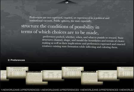
You can watch the clips online or download them. They're informal, funny, and useful. (The latter is only speculation; I've never made an actual narrative-type video.) Topics range from widescreen and 24fps to lighting to basic composition. How to Make a Movie in 10 Easy Steps is a good starting point.

Take Zer0: Everything you need to know before take one: "

‘Hosted by the guys over at Out of Focus Studio, Take Zer0 is a weekly videocast on the subject of filmmaking that gives you everything you need to know before take one.’

"

[via xBlog: The visual thinking weblog | XPLANE]

World's Rarest Rock Instrument: The Birotron

At The Believer, Paul Collins covers the history of the wildly-ahead-of-its-time-and-therefore-doomed-to-brilliant-failure Birotron. After listening to the Yes prog masterpiece Tales from Topographic Oceans over and over again on 8-track in 1974, recently unemployed (all Yes fans were unemployed, I think) Dave Biro wanted to recreate a Mellotron, the tape-loop-based keyboard instrument featured at the opening of The Beatles' Strawberry Fields Forever, Bowie's Space Oddity, and huge swaths of the Yes album in question.

Biro didn't have access to a Mellotron, but he had some steampunk tech smarts, an old piano, and the funds needed to purchase nineteen automobile 8-track decks.

The Birotron's short lifecycle featured financial backing from Yes keyboardist Rick Wakeman, interest from the Mellotron people, a Japanese collector, technical issues with mounting 8-track decks vertically [tip: not a good idea], a renegade Seals and Croft song, and Eleni Mandell's Wishbone. You sort of have to read the whole article for any of this to make any sense.

Aside from technical issues, the Birotron's development was eventually eclipsed by the development and rapid spread of cheap computer chips that powered sampling keyboards.

A rare audio clip of the Birotron is available at Streetly Electronics' website, which has a Birotron in its collection; the site also features some other very cool Mellotron clips.

Finding Something Sort of Like a Specific, Unnamed Font

MyFont's web utility WhatTheFont? takes an interesting approach to selling type: If you want to use a font that you've seen in another publication but can't identify, you can upload a screenshot, scan, or URL (GIF, JPG, etc.) of a bit of text and MyFont will try to match it to one of the fonts they sell.

I can't vouch for the quality of the fonts, but I uploaded some samples and was able to find relatively close matches for around $30 apiece. Not as good, obviously, as locating the actual font you're attempting to duplicate, but a useful option in some circumstances, like when that clients gives you a copy of a magazine ad and says, "I want the text to look like this.

June 05, 2007

The Revolution Will Be Databased

revolution.gif

Revolutionary Left hosts Outlines of a Revolution, an online database of highrez political stencils for DIY t-shirts, posters, tagging (not that I'm promoting such activity), bath towels, etc. Comes in a wide range of political leanings, provided you're the sort of person who already gets the Syracuse Cultural Worker's catalog in your mailbox.

[via Art Threat]

Participatory Design and Inmates

Community Arts Network has an article on artist Peggy Diggs' participatory design projects with prisoners. The projects range from anti-violence t-shirt designs that benefit children's charities to furniture designed to accommodate the particular needs of people in prison cells. Here's a brief description of a project she worked on with women convicted of murdering abusive husbands:

One of her best-known works originated in interviews with women in prison who had been convicted of murdering their abusing husbands. One of the women she interviewed said her activities were so limited that the only public place she was allowed to go was the grocery store. Diggs saw a need to connect with women unable to reach out for help. The result was the "Domestic Violence Milk Carton Project," in which a graphic message was printed on the sides of 1.5 million milk cartons and distributed across New York and New Jersey. The image was the silhouette of a hand superimposed with these words:

WHEN YOU ARGUE AT HOME DOES IT ALWAYS GET OUT OF HAND? If you or someone you know is a victim of domestic violence, call: 1-800-333-SAFE.

[via Art Threat]

May 27, 2007

Richard Serra, Space, and Writing

serra.jpg

Studio 360 ran a brief segment on Richard Serra's retrospective at the Museum of Modern Art [mp3] [slideshow]. I didn't come to Serra's work until about ten years ago, when I saw a PBS biography. Since then, I've thought his outside, architecturally influenced sculpture—works that users move around and within rather than simply view—of an approach that composition and communication might benefit from, particularly as texts become more spatial.

Spatiality in composition is emerge in at least two ways: users of virtual text, in at least some cases, experience texts as spaces that they move within rather than artifacts they view from the outside. Early hypertext forefronted this spatial sense, but it's become common for most people to think of the Web as a space they navigate. (This sense is accelerated in the age of large visual displays.) In addition, physically distributed dataspaces—things like (most recently) Adam Greenfield's concept of "everyware," in which sensing and data devices are distributed throughout a user's physical space—challenge ideas about what constitutes a "text," making the distinction between "text" and "space" meaningless.

Richard Serra's work challenges us to rethink our relations to physical spaces in complex ways: inside/outside, seeing/touching/moving, movement/stasis, etc.

The NYT has a nice piece about the installation procedures for Serra's retrospective at MoMa, a huge task given the size and weight of the pieces, some individual components of which weight 30 tons.

Photo above by Colin PDX at Flickr, CC attribution, non-commercial licensed.

May 24, 2007

CityWall: Public, Collaborative Touchscreen

citysound.jpg

In Helsinki, a public, outdoor installation called CityWall allows multiple users to explore images and video tagged with "Helsinki" on Flickr and YouTube using a multi-touch interface.

The CityWall is designed to support the navigation of media, specifically annotated photos and videos which are continuously gathered in realtime from public sources such as Flickr and YouTube. To contribute content to the CityWall please send pictures and videos via MMS or email to post@citywall.org. Alternatively, tag your media on YouTube or Flickr with 'Helsinki' and we will pick up your media and display it here on the CityWall.

[via New Media Initiatives Blog]

May 19, 2007

Getting In Touch WIth Your Inner Radioactive Child

babylamp.jpg

Genius Jones sells this odd baby lamp. Your choice of orange, green, or blue. A steal at $99. One can never have too many baby lamps.

May 17, 2007

Pre-Recorded Music as Performance

Robert Henke covers the history and current state of pre-recorded music in live performance, from Siemen's (1955) synthesizer to laptop concerts:

Also a classic tape concert typically is annotated with some kind of oral introduction or written statement, helping the audience to gain more insight into the creation of the presented work. I find this kind of concert situation quite interesting and I think it still could serve as a model for today's presentation of various kinds of electronic music. However, while in the academic music world tape concerts are well accepted and understood, there seems to be a need for electronic music outside that academic context to be "performed live" and "on stage", regardless of whether this is really possible or not. The poor producer, forced by record labels and his own ego, or driven by the simple fact that he has to pay his rent, has to perfom music on stage which does not initially work as perfomance, and which has never been "performed" or "played" during the creation at all.

When listening to one of those more or less pre-recorded live sets playing back from a laptop, we have almost no idea of how to evaluate the actual perfomance, and we might want to compare a completely improvised set (which is indeed also possible now with a laptop if you accept reduced complexity of interaction) with a completely pre-recorded set. We have no sense for the kind of work carried out on stage. What we see is that glowing apple in the darkness and a person doing something we cannot figure out even if we are very familiar with the available tools. This scenario is not only unsatisfying for the audience but also for the performing composer. The audience cannot really judge the quality of the performance, only the quality of the underyling musical or visual work, but it might be fooled by a pretentious performer, might compare a complete improvised performance, full of potential failure, with a presentation of a pre- composed and perfectly well-balanced work - without being able to distinguish the two. Also the performer himself might want to be more flexible, might want to interact more, or at least might feel a bit stupid alone with his laptop on a 15 meter long 5 meter deep stage with the audience staring at him, expecting the great show which he will not deliver.

All of which highlights the degree to which, for most people, interpreting and enjoying a performance relies heavily on evaluating the skills of the performer, rather than appreciating the music itself. Which isn't an incorrect interpretation, but only one of many.

[via precious | weblog]

May 16, 2007

Synaesthesia via Augmentation

At Wired, Sunny Bains reports on people who have developed technical means for experiencing synaesthesia, the cognitive condition that results in sensory input crossing boundaries from one sense to another (specific numbers being imbued with colors, odors being experienced as shapes, etc.). In this section, Bains uses a device that translates visual input from a camera into electrical impulses received by the user's tongue:

I could see it. Feel it. Whatever [...] With Arnoldussen behind me carrying the laptop, I walked around the Wicab offices. I managed to avoid most walls and desks, scanning my head from side to side slowly to give myself a wider field of view, like radar. Thinking back on it, I don't remember the feeling of the electrodes on my tongue at all during my walkabout. What I remember are pictures: high-contrast images of cubicle walls and office doors, as though I'd seen them with my eyes. Tyler's group hasn't done the brain imaging studies to figure out why this is so — they don't know whether my visual cortex was processing the information from my tongue or whether some other region was doing the work.
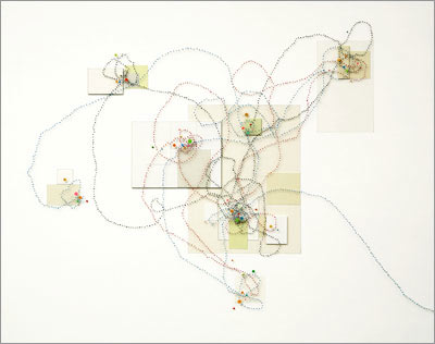
[via Boing Boing]

May 15, 2007

Ten Color Basics

At HGTV's website (I don't watch that channel, I swear), interior designer Marc McCauley provides ten basic color rules. They're explained in the context of interior design, but as McCauley points out, most of them are much more widely applicable. Explaining the 60-30-10 rule, he says,

When you think about it, this color breakdown is similar to a man’s business suit:

60% of the outfit's color is the slacks and jacket
30% of the outfit's color is the shirt
10% of the outfit's color is the tie

[via COLOURlovers]

May 13, 2007

Thirteen Ways of Looking at a Typeface

At Design Observer, Michael Beruit (who knows what he's talking about) offers thirteen ways of looking at a typeface.

9. Because it's ugly.
About 10 years ago, I was asked to redesign the logo for New York magazine. Milton Glaser had based the logo on Bookman Swash Italic, a typeface I found unimaginably dated and ugly. But Glaser's logo had replaced an earlier one by Peter Palazzo that was based on Caslon Italic. I proposed we return to Caslon, and distinctly remember saying, "Bookman Swash Italic is always going to look ugly." The other day, I saw something in the office that really caught my eye. It was set in Bookman Swash Italic, and it looked great. Ugly, but great.

May 07, 2007

Storytelling in Videogames

Ars Technica has the first part of a short series on the importance of storytelling and writing in videogames.

The problem with writing in games is that we point out when it's terrible, but we don't praise it enough when it's good. Consider Half-Life 2.

In the beginning of the game, you're just another desperate citizen pushed through processing before entering the city. People around you are muttering, and if this is your first time playing, you'll likely amazed by the graphics and the Source engine. It's beautiful. Then the megascreen on the building pops up and Dr. Breen appears to explain why the aliens have taken away our ability to reproduce. The quality of the writing makes it worth quoting at length:

Let me read a letter I recently received. "Dear Dr. Breen. Why has the Combine seen fit to suppress our reproductive cycle? Sincerely, A Concerned Citizen."

Thank you for writing, Concerned. Of course your question touches on one of the basic biological impulses, with all its associated hopes and fears for the future of the species. I also detect some unspoken questions. Do our benefactors really know what's best for us? What gives them the right to make this kind of decision for mankind? Will they ever deactivate the suppression field and let us breed again?

[via Ars Technica]

May 04, 2007

PS3: Little Big Planet

Looks like someone's finally starting to use the full processing power of the PlayStation 3. Here's a demo reel (from GDC07) of Little Big Planet. Wow.

Check the post at Precious for some additional images and footage.

[via precious | weblog]

May 03, 2007

John Cage: Water Walk (vintage TV)

From WFMU, a youngish John Cage on the gameshow I've Got a Secret performs Water Walk with bathtub, blender, five unpowered radios, a blender, and more. (The radios weren't plugged in, according to the host and Cage, due to a union dispute about which crew could handle the radios.)

[via Your Daily Awesome]

April 30, 2007

Will Self: One Writer's Room

self.jpg

Phil Grey documents novelist Will Self's writing room in 71 photographs. Self's space is extremely densely packed with information (there must be thousands of Post-Its on the walls) and surprisingly, extraordinarily organized.

[via kottke.org]

April 27, 2007

Thought Crime: Student Arrested for Fictional Essay

The Chicago Trib reports that a senior at Care-Grove High School was arrested last Monday for writing an essay "described as violently disturbing but not directed toward any specific person or location."

According to the Trib, the straight-A student completed the assignment for a Creative English class that asked students to "identify and utilize poetic conventions to communicate ideas and emotions." The article does, however, say that students were warned to stay away from writing things that "posed a threat to self and others" in the wake of the VT shootings.

This just in: Warrants issued for the arrests of Quentin Tarrantino, Clive Barker, Eddie Vedder, Gus Van Sant, and the corpses of Kathy Acker and William S Burroughs.

[via Slashdot]

Musical Language

I heard a re-broadcast of the show Radio Lab on Musical Language today; interesting material for anyone looking at the intersection of (duh) music and language. The show included segments on meaningful commonalities in tone used by parents to infants across (apparently) all language, the initial furor then rapid acclimation for Stravinsky's Rites of Spring, and Diana Deutsch's research propensity towards perfect pitch in speakers of tonal languages:

For those of us who have trouble staying in tune when we sing, Deutsch has some exciting news. The problem might not be your ears, but your language. She tells us about tone languages, such as Mandarin and Vietnamese, which rely on pitch to convey the meaning of a word. Turns out speakers of tone languages are exponentially more inclined to have absolute (AKA 'perfect') pitch. And, nope, English isn't one of them.

Radio Lab has recently become one of my favorite shows. In that genre of radio variety/magazine-type shows, it's structured sort of like This American Life, but substituting geekiness for hip. Other recent episodes include Space, Detective Stories, and Morality.

April 25, 2007

McCloud Web-Based Graphic Novel Now Free

Scott McCloud has posted the first two (of three planned) volumes of his graphic novel "The Right Number" online for free. (Parts one and two were previously available under a now-defunction micropayments system.) The storyline and drawing are great, and the Flash interface actually makes navigating the content easier and interesting (rather than detracting from the experience).

[via Boing Boing]

April 24, 2007

The Art of Storytelling

Your Daily Awesome links to four short (5m each) videos of Ira Glass talking about the art of storytelling.

(Your Daily Awesome isn't just an empty boast of a title for the weblog. Only one post a day, but the quality tends towards very good (even "awesome"). The last few weeks have seen links to the audio of Melle Mel discussing the early rap track, "The Message" on Fresh Air, short animated films based on the poetry of Billy Collins, The Helsinki Complaints Choir, and photographs from the Arkansas State Prison, 1915-1937.)

[via kottke.org]

April 20, 2007

Intentionally Inaccessible Game Design (As Learning Tool)

GameOver! is an educational game designed to teach people about accessibilty—by counter-example. (Versions available for OS X, Windows, and Linux.)

The game comprises twenty-one levels, each of which violates a fundamental game accessibility guideline. An overview of the title, gameplay and violated guideline of each level is provided the "Game Levels" section of the site, while screenshots from some of the levels are illustrated in Figure 3. The player can select to play the game from the first level, or directly jump to a specific level. At the beginning of each level, its title is presented along with some guidance (e.g., the controls that can be used, the player's goal). In order to move from one level to the next one, the player must first lose three lives. Each time that a life is lost, one hundred points are subtracted from the player's score. At the end of each level, a famous quote related to the level's content is recited (a "punch line") and the guideline that was violated is displayed (see Figure 2). At the end of the game, a summary of the level titles and the corresponding (violated) guidelines are presented.

I regularly teach with counter-example assignments. They seem to be great learning tools—the act of creating objects that intentionally don't work both helps students see the effects of breaking guidelines and, in the process, helps make those guidelines more memorable.

[via Kotaku]

zombieattack: Twitter Finally Gets Interesting

There's something odd about continually alerting everyone to your mundane activities ("reading journal articles," "rebooting computer," "listening to the pixies") via Twitter (those examples were all my own, btw, but typical). But zombieattack, apparently collecting living humans, friended me today, so I checked out their posts. It's a short story written in brief bursts. Posted in semi-realtime, it's actually pretty creepy to watch unfold.

The combination of the hang over and my healing arm is almost unbearable. I hope we can stay here for a while. 03:34 PM April 16, 2007

They couple says we can stay here for as long as we like, and we intend to, it feels so good to have people caring for us again 10:28 PM April 16, 2007

My arm has kept me up so i went outside to look at the sky, it is full of stars, is this a sign that things are going to get better? 03:38 AM April 17, 2007

After Lunch Matt and I decide to go get some food and supplies for both the couple and us. It is such a beautiful day. 03:18 PM April 17, 2007

We both wake up earlier today, we check around the house, its all clean, no signs of the infected or anything, things are getting better. 12:00 PM April 17, 2007

We buy a special surprise for the couple, just as a thank you doing all they have done for us. Time to get back before it gets to dark. 09:22 PM April 17, 2007

We're back at the house. We're about to go sleep. There is a noise coming from the couples' room. It's probably nothing. 02:34 AM April 18, 2007

April 19, 2007

Writing the Self

"You know?" Mark pulls his hand from Weber's and fakes a feeble grin. "I was sure, back then, when you told me that, that you'd lost your fucking mind." He squeezes his eyes and shakes his head. Time's running out. He's losing his insight to a chemical cocktail seeping into his arms. He can't quite name the thing he needs to say. The struggle runs the length of his body. He wrestles to grasp the thing that stands just three feet out of reach. "My brain, all those split parts, trying to convince each other. Dozens of lost scouts waving crappy flashlights in the woods at night. Where's me?"

Weber could tell stories. The sufferers of automatism, their bodies moving without consciousness. The metamorphopsias, plagued by oranges the size of beach balls and pencils the size of matchsticks. The amnesiacs. The owners of vivid, detailed memories that never happened. Me is a rushed draft, pasted up by committee, trying to trick some junior editor into publishing it. "I don't know," Weber says.

Richard Powers, The Echo Maker [amazon link]

April 16, 2007

Plastic Dreams of Airports

Plastic Dreams of Airports

You write where and when you can. (Part of an unfinished novel.)

April 12, 2007

Kurt Vonnegut, RIP

Dammit. [NYT obit, LA Times obit, Reuters obit.]

Well, the telling of jokes is an art of its own, and it always rises from some emotional threat. The best jokes are dangerous, and dangerous because they are in some way truthful.

Kurt Vonnegut, Interview, Mcsweeneys.net

[via kottke.org, and a bunch of other wehlogs]

Pencils Made from Human Remains

pencil.jpg

Note to Underdog: I used to think that when I died, I wanted to be cremated and have my ashes dumped into the water supply for New York City, but I've changed my mind: It appears that I can have the carbon from my ashes made into pencils.

[via things magazine]

Kick Out the Jams [etc.]: IP and Documentary Rights

Metafilter gathers several important links to the intellectual property lawsuits surrounding "A True Testimonial," the documentary about seminal Detroit pre-punk group MC5. [allmusic.com entry on MC5 and Wikipedia entry on MC5.] As with many music-scene documentaries, IP issues frequently try to block important historical reporting. The recent court decisions in this case are a good sign for documentary filmmakers.

"It's good to remember the 60's, but some say if you remember the 60's you weren't there. Perhaps to assist all of us in remembering the 60's, Defendants David Thomas and Laurel Legler made a film on the MC5, a 60's Detroit Rock and Roll band that made its mark on American history with loud rock and roll and radical perceptions positing an imperialistic and materialistic America. This lawsuit teaches that materialism remains with us, as Plaintiffs vigorously seek money from Defendants. Although the MC5 faded away largely due to drugs, the band lingers on in the memory of many, and would be known to many other but for pending legal feuds."

The Honorable Andrew J Guilford, United States District Judge
Findings Of Fact And Conclusions Of Law, issued March 31, 2007

[via metafilter.com]

April 10, 2007

Myths and Legends Story Creator

myth.jpg

Myths and Legends has a beta version of their online story creator. It appears to be designed for K12 teachers and students, but it might also be useful for storyboarding other types of projects such as exploring narrative structure, mapping out video projects, etc. (I wish I'd found this at the beginning of the semester for my Narrative and New Media class; at this point late in the semester, my students are already well into developing their final projects.)

[via metafilter.com]

April 07, 2007

Best Website By a Non-Website-Designer Award

Goes to ... No One Belongs Here.

no_one.jpg

Sometimes, rarely, ingenuity beats tech smarts. Very nice. (But I kept thinking, "Damn, her stove is really clean. Let alone the top of her fridge. I hate her.)

April 04, 2007

House Attack

houseattack.jpg

Too cool. An art installation by Erwin Wurm at MUMOK in Vienna. More at anArchitecture.

The idea for „House Attack“emerged while planning the MUMOK retrospective. „House Attack“ is a single-family house that crashes into the roof of the museum, a house like one that might be built at Blaue Laguene (Blue Lagoon), a prefab housing development in southern Vienna. A symbol for conservative, small-minded longings, the single-family house collides into the museum as an temple to the muses, and the museum itself now also becomes part of the sculpture. „House Attack“confuses our perception of art and everyday reality and in its striking appearance and humorous, dramatic staging of the banal is a perfect example of current developments in the artist's work.

[via anArchitecture]

How to Make a Video Pilot

Channel 101 and Acceptable.tv have eight low-budget, tongue-in-cheek video tutorials on how to make a video pilot episode. Includes Jack Black as the Story Wizard and an Andy Dick cameo as a police car. They're clumsily funny, but also filled with good advice.

[via metafilter.com]

March 29, 2007

Rules and Context

In most of my classes, we spend the first 2/3 of the semester covering theory, concepts, and principles. In the last 1/3 of the semester, we move into realworld projects. I'm amazed at how consistently the final projects (new media texts, websites, etc.) seem to forget the first 2/3 of the course and just forge, relatively blindly, ahead into final designs that seem somewhat inspired, but very muddled. This, I know, is a common problem for most teachers. I've tried other variations on the structure—rubrics for the final project that clearly lay out how students need to use design rules in final projects, putting smaller projects earlier rather than a monolithic one at the end, etc. I sometimes spend a full class at the start of the final project overviewing the major conceptual/theoretical work we've covered, reminding students that the final projects are their opportunity to demonstrate that they know how to apply the concepts/theories. Not much luck. (If you're one of my students and you're reading this weblog entry, obviously you're an exception.)

At Design View, Andy Rutledge has some great examples of the interaction of context and design guidelines (he claims they're inviolable rules, but I think on rare occasions any and all of them can be broken to great effect—but that's a rare thing for a new designer to achieve, rare enough to be an accident).

Among the more counterintuitive characteristics of art and design is the fact that these endeavors are governed by rules. The rules of artistry (and therefore design) are inviolate and unchanging. If you don’t obey the rules, your results will be boring, uninspiring, uncommunicative, and less than compelling. In short: poor art or poor design.

[via Andy Rutledge : Design View]

Vier5: Typography, Modern and/or New

vier5.jpg

At Design Observer, Dmitri Siegel discusses the work of designers Vier5, who problematize the distinctions between "modern," "postmodern," and "new" with work such as the exhibition poster above.

As Bruno Latour explored in We Have Never Been Modern, modernity is on the one hand characterized by parsing the differences between things like culture and nature, while at the same time it constructs systems that mix politics, science, technology, nature, and so on. Vier5's work, with its blending of the hand-made and the digital, embodies this contradictory quality. Latour suggests moving beyond a worldview of distinctions and instead accepting continuity between eras, cultures, and epistemes — essentially rejecting the idea of newness. This approach allows us to move beyond a historically fixed idea of modernity and to embrace the connections between Tschichold and Vier5.

It is easy to fall back on clichés about the end of history and the post-modern condition, but this historical awareness can be just a convenient excuse for historicism. I’m not completely convinced that every historical moment requires new letterforms (this assertion contradicts one aspect of Modernism I find myself nostalgic for — the goal of universality and commonality), but Vier5’s unapologetic use of the word modern and their quest for the new is gutsy. Their work raises the question: is there a difference between being new and being modern?

[via Design Observer: Main Posts]

Songs as Short Stories

The Onion A/V Club has a nice list of 26 Songs That Are Just As Good As Short Stories. Most of the music I listen to is imagistic—Wilco, Sonic Youth, Sparklehorse—but songs that manage to lay out an compelling narrative in a relatively small number of words—compared to short stories—are both rare and wonderful. Onion A/V's list is wide-ranging and interesting (I have about half these songs in my iTunes library): Elvis Presley's "In the Ghetto" (which I hadn't realized was written by Mac Davis); Jawbreaker's "Chesterfield King"; Johnny Cash's "A Boy Named Sue" (which I knew Shel Silverstein wrote); Pulp's "David's Last Summer". Here's one entry, for a song by The Handsome Family, my favorite post-ironic postmodern band:

17. The Handsome Family, "After We Shot The Grizzly"

As a lyricist, Rennie Sparks has a lot in common with writers like Flannery O'Connor and Patricia Highsmith, both for her narrative sensibility and her darkly comic, macabre attitude. "After We Shot The Grizzly," from last year's Last Days Of Wonder, follows the grim misadventures of a group of plane-crash survivors who struggle in vain against their inevitable descent into savagery and death—sort of Lost as portrayed by the Donner party. Brett Sparks' understated performance and Rennie's deadpan sense of humor make the song something of an anti-epic, with an increasing sense of twilit mystery as the survivors disappear one by one into the darkness and the silent waves, never to be seen again.

The comments section at the end of the entry has some great additions.

[via Fimoculous.com]

March 27, 2007

Stripgenerator: DIY Comics

Collin vs. Blog laments the tragedy of a Saturday afternoon presentation slot at a recent conference—when composition teachers gather for conferences, Saturday afternoon is when everyone heads out to see the big city, making attendance at presentations in that time slot tend toward sparseness. (I have to admit, I didn't even check the conference program to see who was presenting that late in the week—apologies, because it sounds like it would have been worth attending.) But he mentions stripgenerator, a website that lets you compose simple comics using your own images or their supplied clip art and dialogue balloons—it's pretty cool. Just add wit, something I only have meager reserves of at this point in the semester.

riddle.jpg

March 24, 2007

NYC

fans

(The view outside of our window. Somewhat industrial, but I liked the tonality and composition.)

The other good image I got was from the third-floor balcony in MoMA:

MoMA Gallery

(Click either of the images to go to the Flickr pages, where you can access more-detailed versions from the "All Sizes" tabs.)

March 20, 2007

CCCC Talk

spimes.jpg

Here are the slides and notes to my CCCC talk. They're rough, and I'll probably heavily modify them on the train to NYC and then again in the hotel room. But it's a start... [.pdf (9 MB).]

March 15, 2007

Remix: Someone in Congress Gets It

Some almost surreal comments at the "Future of Radio" House Telecom and Internet Subcommittee Hearing voiced by Rep. Mike Doyle (D-PA) on the importance of remixing as a creative act (and contrary to existing IP law):

Congressman Doyle: Mr. Chairman, I want to tell you a story of a local guy done good. His name is Greg Gillis and by day he is a biomedical engineer in Pittsburgh. At night, he DJs under the name Girl Talk. His latest mash-up record made the top 2006 albums list from Rolling Stone, Pitchfork and Spin Magazine amongst others. His shtick as the Chicago Tribune wrote about him is "based on the notion that some sampling of copyrighted material, especially when manipulated and recontextualized into a new art form is legit and deserves to be heard."

[..]

I hope that everyone involved will take a step back and ask themselves if mash-ups and mixtapes are really different or if it's the same as Paul McCartney admitting that he nicked the Chuck Berry bass-riff and used it on the Beatle's hit "I Saw Her Standing There."

There's much more in the full (unofficial) transcript at The 463: Inside Tech Policy weblog. There's also video available.

[via Fimoculous.com]

March 11, 2007

Writer's Rooms

ballard.jpg

J.G. Ballard is featured in the latest installment "Writer's Rooms" at the Guardian Unlimited. The series asks writers to comment on a picture of their workspace.

The first drafts of my novels have all been written in longhand and then I type them up on my old electric. I have resisted getting a computer because I distrust the whole PC thing. I don't think a great book has yet been written on computer.

I have worked at this desk for the past 47 years. All my novels have been written on it, and old papers of every kind have accumulated like a great reef. The chair is an old dining-room chair that my mother brought back from China and probably one I sat on as a child, so it has known me for a very long time. A Paolozzi screen-print is resting against the door, which now serves as a cat barrier during the summer months. My neighbour's cats are enormously affectionate, and in the summer leap up on to my desk and then churn up all my papers into a huge whirlwind. They are my fiercest critics.

Other writers featured include A.S. Byatt, David Lodge, and Sarah Waters, among others.

[via ballardian]

March 08, 2007

Gehry on the Abu Dhabi Guggenhiem

At the Register, Frank Gehry discusses aging, the start of the new Abu Dhabi Guggenheim, and architectural criticism:

I've just turned 78, but I hope I'm not stuck in a groove like some old long-playing record. One of your British journalists thinks so; he described my recent buildings as "crude curlicues". If you know who he is, get him to try on some concrete overshoes for size. I'll send them over . . .

[via things magazine]

March 01, 2007

Mose & Teaching & Learning

[update: Wait, I read that image wrong: The teacher is holding a hammer and working left to right, rather than an axe and moving right to left. Drawn!'s interpretation seems correct.]

mose.jpg

The always intriguing Drawn! had a completely different take on this comic by Adam Cohen, from his series Mose. Here's Drawn!'s take on the comic:

I had a teacher like this once! Thankfully, I lived to tell the tale. And apparently so did Adam Cohen, creator of the online comic feature Mose. Mose is a series of experimental, and seemingly nonsensical at times, comics. Adam’s style morphs in and out of experimental stages, but the quality of the drawing and the humour is consistent throughout. I’m now a fan!

Actually, most of the best teachers I've had—the ones who uncorked the stopper at the top of my head and let bright things come out, were also teachers who I sometimes felt like I'd survived. So maybe Drawn! is right: Learning is often painful. But in a good sort of way.

[via Drawn!]

February 27, 2007

Web Design Inspiration

Patrick Haney has posted more than 300 screenshots of cool website designs, which he hopes will inspire other web designers in their work. Cool idea.

[via things magazine]

Art Threat

This looks promising: Art Threat is a new web and print magazine about political art.

Art Threat is a journal of political art. We embrace art that confronts, interrogates, or even shrugs off the status quo. Art Threat looks for creativity that threatens the conventional wisdom with progressive ideas. By highlighting political artists and their work, and by challenging those who deny the political, Art Threat supports the creation of critical culture and strives to inspire people to act.

[via Drawn!]

February 25, 2007

Start, Finish: Best Opening or Closing Lines of an Academic Text

Crooked Timber has a post gathering the best opening or close lines of academic texts. Here is one submission, from the opening lines of Claude Levi-Strauss, Tristes Tropiques:

Travel and travellers are two things I loathe—and yet, here I am, all set to tell the story of my expeditions. But at least I’ve taken a long while to make up my mind to it: fifteen years have passed since I left Brazil for the last time and often, during those years, I’ve planned to write this book, but I’ve always been held back by a sort of shame and disgust. So much would have to be said that has no possible interest: insipid details, incidents of no significance. Anthropology is a profession in which adventure plays no part; merely one of its bondages, it represents no more than a dead weight of weeks or months wasted en route; hours spent in idleness when one’s informant has given one the slip; hunger, exhaustion, illness as like as not; and those thousand and one routine duties which eat up most of our days to no purpose and reduce our “perilous existence” in the virgin forest to a simulacrum of military service…

The best ending section I have written is still probably from Nostalgic Angels, my first book; it is a little over-wraught, but at the ending, you get like that:

Imperfect angels, nostalgic for a past that never was, we might instead learn to live as cyborgs. In mapping hypertext use we do not create a new world from nothing, but we do create discourses in which old worlds might be transformed.

Or there is this text I cribbed from Jeff Noon’s Falling Out of Cars, which ends the last chapter of Datacloud (a chapter completely comprised of quotations from other texts):

Tupelo sleeps on the other bed, breathing gently, and sometimes sighing. I have covered the lamp with an old shirt from my bag; now the light barely touches the girl, but falls steadily on the notebook as I write. I have taken advantage of the needle’s sweetness, to hold the day in words; and the pages I have just written, and the pages already written, they seem to make a kind of sense now. I have knowledge of the story once more, my own story, my place in the story.

[via metafilter.com]

February 24, 2007

Typography: What Does Marsellus Wallace Look Like?

marcellus.jpg

This is the most brilliant piece of typographic motion I have seen in a long time (maybe since the opening credits to Se7en): What Does Marsellus Wallace Look Like (.mov link, NSFW) riffs on the Pulp Fiction scene, early in the movie, where Samuel L. Jackson interrogates that kid who he and John Travolta have been sent to deal with. (I haven’t seen Helvetica, The Movie yet, though, so that may soon occupy my top spot.)

The boingboing post on this also includes several related items.

February 23, 2007

Let There Be Rock

This week is, apparently, the fifty-sixth anniversary of the introduction of the Fender Telecaster [wikipedia link]. For those of you under forty, this is what geeks you to spend thousands of hours mastering, prior to WoW, Halo, and Grand Theft Auto.

(Dammit. Now my ] key is non-functional. I had to get the ones in this post by copying/pasting one from a previous post to work/space. This machine is going back to Apple on Monday.)

February 21, 2007

Arranging Things: A Rhetoric of Object Placement

Leonard Koren's Arranging Things: A Rhetoric of Object Placement looks at, well, the meaning of object arrangement [amazon link]. Which I've always found is harder to do well than it looks. I tend to just stack things up in large piles that sit there, unartfully and unrhetorically, snoring. (Rhetoric scholars, I've discovered, are among the least rhetorically skilled people I know.)

This book started out as an attempt to understand what made the arrangements I saw in a San Francisco store, Japonesque, so extraordinary. For years I visited Japonesque and enjoyed the unique arrangements of ceramic, rock, old wood, plant materials plus other sundry and eclectic objects and wondered what it was that gave them their imaginative vitality. Of course I asked the proprietor/arranger (Koichi Hara) how he did what he did. But after a few conversations it became obvious that he was either unable, or unwilling, to articulate his secrets.[...] I pragmatically concluded that there was no algorithm or formula for exceptional arrangement design, yet I suspected that the conceptual principles of superior arrangement must exist or could be manufactured and that I could find them if I just persisted. So I changed my methodology. Instead of relying on arrangement practitioners for insights, I attacked the literature of art, art history, criticism, merchandising display, communication theory, literary theory . . . until I chanced upon rhetoric (see page 24). Anyway, I had my rhetoric epiphany six months after I had commissioned the paintings. . . .

Beating Illustrator's Block

Dani Draws offers 101 simple but creative prompts for illustrators. (These would be useful for design classes.)

3. Illustrate a song.

4. Make a narrative advertisement for a soft drink.

14. Illustrate a day in the life of a cat, dog, fish, or monkey.

18. Make a magazine cover for a current news story.

30. Create two versions of the same painting — one with warm colors, one with cool colors.

67. Create a classic movie poster for your favorite modern movie.

[via Boing Boing]

Going Big: Multi-Story Laser Graffiti

tags.jpg

Graffiti Research Labs comes up with a guerrilla method for for using lasers to draw enormous (temporary) tags on tall buildings.

[via Gizmodo]

February 17, 2007

Jean-Paul Sartre, 911 Operator

From McSweeneys, Jean-Paul Sartre if he worked as a 911 operator:

OPERATOR: 911. What is your urgence?

CALLER: Hello? What? Hello?

OPERATOR: Que voulez-vous? What do you want?

CALLER: I think there's an intruder in my house. Will you send the police? Please. Please hurry.

OPERATOR: Putain! I have said before, Man is not the sum of what he has already, but rather the sum of what he does not yet have, of what he could have. Hmm, I wonder how I feel about things he once had but now doesn't, or won't—I am referring to this intruder, bien sûr. Man is anguish. Doors open. Structures like poverty have the literal agency of the component, individual human being, but this class structure is a destine and we can speak cogently of social forces which bring to bear causality and turn us into esclaves—you know ... slaves. This is a truism. A must for humanité. Or at least for frère breaking and entering, non?

CALLER: I swear to God, man. You've gotta do something. Are you speaking French or something? Are you even listening to me, man? I think this guy may be coming up the stairs. Oh, God, I'm scared. Please send somebody.

OPERATOR: Appropriating by destruction. Such horror. But, as they say in greeting cards, À coeur vaillant rien d'impossible. What a load! But I don't mean to upset you, you know that, eh?

Raph Koster: "But is it art?"

Raph Koster riffs in some wonderful ways on ludology vs. narrative in Ferry Halim's "High Delivery":

To me, this is a great example of how the underlying meaning of mechanics (lack of control, impossibility of completing a task) can be reinforced and thematized by a well-chosen metaphor. This is a mechanic that games generally don’t go near. “Difficult controls” is seen as anathema to good gameplay usually (though some games, like Marble Blast Ultra and similar, are of course entirely driven by the challenge of mastering controls).

Hint: Your cursor controls a breeze that pushes the balloon around (up, down, left, right). And turn the sound up—it's a very fitting atmospheric track.

[via Raph's Website]

February 15, 2007

Barry White, Performed by Gollum & Smeagol (YouTube)

A pretty bizarre (but extremely well done) remix.

[via Boing Boing]

February 13, 2007

Tweaking Punctuation

Mostly of interest to font geeks, but U&lc has some tips (and reasons) for adjusting punctuation typography.

Sometimes a subtle adjustment in a character’s position can make a big difference in the visual balance of your typesetting. Case in point: hyphens, en- and em-dashes, parentheses, braces and brackets will often look fine in lowercase settings, but can appear too low when set next to caps and lining figures. The larger the setting (in headlines, for example), the more noticeable this will be.

February 08, 2007

ASCII Art

johndan.gif

Typorganism lets you upload a 50x60 pixel image and converts it to ASCII art. Much easier than the last time I did one of these, which was in 1985 and involved six hours of coding print commands in Pascal.

[via Be A Design Group]

Love and Theft: Lethem on Plagiarism

(As you can tell, I'm interested in how plagiarism, something academics tend to paint with a very broad, monochromatic brush, functions as a creative act in different disciplines.) In this Harper's piece, Jonathan Lethem explores the act of borrowing (in theory and practice) in Bob Dylan's lyrics, Thomas Jefferson's politics, T.S. Eliot's "The Waste Land," and more.

[via Fimoculous.com]

The Good Citizen's Alphabet

bolshevik.jpg

Design Observer has posted a slideshow of the pages from Bertrand Russell's The Good Citizen's Alphabet.

[via Design Observer: Main Posts]

Can Photographers be Plagiarists?

Slate asks if photographers can be plagiarists? (Launch the slideshow).

(Via metafilter.com.)

February 06, 2007

Golfing with Joyce and Beckett

Golfing with James Joyce and Samuel Becket (a short film).

[via Fimoculous.com]

February 04, 2007

Spatial Stories

gothamberg.jpg

Gothamberg Apartment Stories is structured hypertextually and architecturally, in something like an organized tag cloud.

Everyone who has lived in an apartment has a story to tell. Gothamberg is a place to read, interact and exchange stories of lives in apartment buildings. Together, these tales of sounds and smells, lobbies and bathrooms, laundry room gossip and unexpected favors form a single collective building, Gothamberg. Their experiences form the elliptical threads of inhabitation, a mnemonic quality expressing something of the shared nature of dwelling.

[via information aesthetics]

February 03, 2007

Road Case

Road Case

February 02, 2007

Database Cinema

soft-cinema.jpg

Lev Manovich's new project, the DVD Soft Cinema: Navigating the Database, sounds promising. Manovich teams with new media artist Andreas Kratky and several key new media folk:

What kind of cinema is appropriate for the age of Google and blogging? Automatic surveillance and self-guided missiles? Consumer profiling and CNN? To investigate answers to this question Lev Manovich - one of today’s most influential thinkers in the fields of media arts and digital culture – has paired with award-winning new media artist and designer Andreas Kratky to create the Soft Cinema project. They have also invited contributions from leaders in other cultural fields: DJ Spooky, Scanner, George Lewis and Jóhann Jóhannsson (music), servo and Andreas Angelidakis (architecture), Schoenerwissen/Office for Computational Design (data visualization), and Ross Cooper Studios (media design).

SOFT CINEMA: Navigating the Database is the Soft Cinema project’s first DVD published and distributed by The MIT Press (2005). Although the three films presented on the DVD reference the familiar genres of cinema, the process by which they were created and the resulting aesthetics fully belong to the software age. They demonstrate the possibilities of soft(ware) cinema - a 'cinema' in which human subjectivity and the variable choices made by custom software combine to create films that can run infinitely without ever exactly repeating the same image sequences, screen layouts and narratives.

'Mission to Earth' is a science fiction allegory of the immigrant experience. It adopts the variable choices and multi-frame layout of the Soft Cinema system to represent ‘variable identity’. 'Absences' is a lyrical black and white narrative that relies on algorithms normally deployed in military and civilian surveillance applications to determine the editing of video and audio. 'Texas' is a ‘database narrative’, which assembles its visuals, sounds, narratives, and even the identities of its characters from multiple databases.

The DVD was designed and programmed so that there is no single version of any of the films. All the elements – including screen layout, the visuals and their combination, the music, the narrative, and the length – are subject to change every time the film is viewed.

[via Bruce Sterling]


January 30, 2007

Love is a Mix Tape

Keith Harris reviews Rob Sheffield's mixtape-chronicled ode to his departed wife, Love is a Mix Tape. I haven't read Sheffield's book yet, but Harris' review makes it sound deeply interesting:

On his blog, New Yorker pop music critic Sasha Frere-Jones has wondered when someone will title a review of Love Is a Mix Tape "The Year of Musical Thinking." And true, as with Joan Didion's compressed tour of Stygian dementia, Sheffield analyzes how death alters your consciousness, though with much deeper insight into the mystery of Missy Elliott's "The Rain (Supa Dupa Fly)." And death lurks throughout Sheffield's '90s, as indicated by his brilliant reading of Nirvana's Unplugged—"Contrary to what people said at the time, [Kurt Cobain] didn't sound dead, or about to die, or anything like that. As far as I could tell, his voice was not just alive, but raging to stay that way." (Just as pertinent is an aside that Renee thought "Heart-Shaped Box" ripped off Blondie's "Call Me." It did. Never thought of that.)

(Oddly, I heard "Heart-Shapted Box" on the radio this afternoon on the way back from Burlington.)

[via Fimoculous.com]

January 26, 2007

Architecture in QuickTime VR

Columbia University's Real?Virtual has an impressive set of QuickTime VR architectural shots and interactive plan views from various historical/cultral works, including a first-century Roman ampitheater in Sicily, Le Corbusier's Church of Notre Dame du Haut, Frank Lloyd Wright's Fallingwater, and the Shehzade Mosque in Istanbul. Site navigation is a little wonky, but worth exploring.

[via things magazine]

January 24, 2007

Graphs are the new narratives

isthenew.jpg

Leisure Arts has a nice chart documenting uses of "x is the new y" from (unspecified) media sources. A small chunk of it's shown above.

[via Noisy Decent Graphics]

January 21, 2007

On My Desk

gibson.jpg

On My Desk gathers images and narratives from artists and other "creative folk" (their term, but I guess it works) showing their workspaces. Above image is from a post by Dallas artist Geoff Gibson:

I've been crafting this mess for about four years and feel it could only be better in a tree on a beach. the clutter is key to my workflow. I'm easily bored and quickly disinterested in things going too well or in need of finishing. the visual noise keeps my eyes darting and mind popping as i drift away. the reference books and multiple on-going projects give me things to do while avoiding things I feel I should be concentrating on. thus i make scattered-but-steady unintended progress despite my laziness and lack of focus. this is my zone.

Some of these are extremely interesting (at least if you're interested in the kinds of things I'm interested in).

[via email from Anne]

Public Domain Images

As a followup to last week's post on free, re-usable clipart and stock photography, here's Lifehacker's list of six ways to find public domain work (images, video, audio, etc.) you can (legally) use without paying royalties. The list includes both primary sources (such as CC's list of songs licensed for mixes) and strategies for finding images and documents using Google. Cool.

[via Lifehacker]

Designer is the New DJ

Grooveeffect looks at smallscale, web- and computer-enabled DIY clothing design and street culture and suggests that "the designer is the new DJ":

‘Street culture’ is the latest trend bubbling up from the underground, but you don’t need me to tell you that. This site is a testament to that, as are the dozens of other sites, blogs, and forums that spread news on the scene. The art, the fashion, the accessories – it’s everywhere. Fixie bikes are blowing up. Luxury streetwear is blowing up. Sneaker culture is blowing up. Graffiti culture is blowing up. Skating is blowing up (again).

The argument makes sense, particularly in areas of design that rely heavily on remixing (of which street culture is one). Adam Koford's "Have a Nice Che" t-shirt, featuring the icon smile face on the just-as-iconic Che image, for example, utilize standard images, a little computer image combination, and one of many websites that offer production and distribution facilities for micro-run items.

che.jpg

I'm not one of those who believes strongly in that whole "The Internet Democratizes Everything Completely" story. Having access to a printing press doesn't make you an author—there are still numerous forces that strongly determine what is popular, and access to publishing isn't a panacea. Big media, for example, still has a strong hand in structuring popularity (even for DJs). Access to the web opens the fashion industry to anyone—but you have to supply your own design smarts. Still, this does open up new possibilities for many people.

[via The Mediaburn Radio Weblog]

January 20, 2007

Compendium of Public-Domain Image Links

Nonpartisan posts a list of links to public-domain and CC-licensed image collections. Some of these were new to me. Licenses at the sites vary, so check specifics. (And be sure to check the comments section for additional links, such as the always useful morgueFile.)

[via Daily Kos]

January 19, 2007

Architecture & Criticism

Johnathan Glancey has an interesting meditation on the symbiotic connection between architects and critics at Guardian UK. He makes some points (as you might expect) that are relevant to any complex design work—software, products, cooking—that people actually use:

[A]rchitecture is a process. The critic is a part of that process, too, and always has been. Even if negative, criticism plays its part in the course of architectural thinking. There are critics who love to be an intimate part of the architectural process and who might well be good friends with the architectural profession. Equally, there are those who are largely detached from everyday professional concerns, yet who make architects, and those who experience their buildings, think in ways outside their own approaches and prejudices.

[via things magazine]

January 18, 2007

Tokyo HDR Shot

tokyo.jpg

I've had to extremely downsample this to make it fit (in terms of both size and compression), but you should check out this HDR (High Dynamic Range) cityscape of Tokyo in the largest size your monitor will allow. It's the closest thing to a Bladerunner shot I've seen in a long time.

HDR shots involve taking multiple shots of a scene, stepping up and down the exposure by several notches for each shot, then combining them all to give a wider range of exposures in a single shot. You can see more examples of the technique at the Flickr HDR Pool.

[via Gizmodo]

January 16, 2007

Understanding Comics Recursion

The weblog Drawn! points to a 37 Signals discussion of Scott McCloud's Understanding Comics.

I read Understanding Comics several years ago, on the advice of a videogame designer. I was a little skeptical, but McCloud's analysis of how comics work is remarkably insightful about communication in general: not just in how things are created, but how to design things that people can engage with. We're using the text in my Narrative for New Media course this semester; we're just starting, so I'm not sure how it will go, but the students said it looked interesting.

January 13, 2007

Diagramming Sentences: Post-Pedagogical

Michael Erard at Design Observer discusses the aesthetics of sentence diagramming. Erard admits that the practice has long been shown to have little effect on learning grammar or writing, but he still finds a place for it:

But diagramming is kinky because it forces the structure of language to wear the clothes of images. A sentence diagram is less a map than a portrait, and in this vaudeville language is painted, corsetted and trussed.

The piece also includes a graphic of one of Groucho Marx's puns, a brief history of sentence diagramming, and nuns.

[via Design Observer]

January 08, 2007

Location-Based Narrative

The Interpretive Engine tells a story in three chapters, one of which you can read online from anywhere; the other two must be read within range of a wifi connection at specific geographical locations (one in Santa Fe, the other in Fresno).

The early history of the telecommunications and transportation industries inspires this story, told by 6 characters. In the Industrial Era communications, navigation, and transportation systems existed side by side in an interdependent network. These technologies as well as the profound philosophical, theological, and social shifts that ushered them in figure prominently in this story.

Characters include The Hungry Ghost, who worked in the Bureau of Time and wanders between 1884 and the present; her Guardian; children contemplating the meaning of time and space, and a Narrator.

The characters are accessed through 1885 and 1950 maps of Fresno. You are represented in the middle of the map interface at all times by an asterisk-like symbol. Simply use the arrow keys on your keyboard to navigate around the map and trigger the characters in the story. Your symbol must collide with other Character symbols to trigger audio content. The various characters can be recognized by the icon representing them on the map.

[via things magazine]

January 05, 2007

Venn Diagram Jokes

parole.gif

Jessica Hay has a weblog consisting entirely of funny Venn diagrams written on index cards. Which is a lot funnier than it sounds.

[via Boing Boing]

January 04, 2007

How To Choose a Good Font

type.jpg

Typography has an extremely well-done explanation of typography basics, one of the best brief intros to type I've seen on the web. (There are better books on type—buy Bringhurst if you get serious about this. But this the best short web intro I've seen.)

All this stuff—counters, x-height, kerning—seems really mysterious and unimportant at first, but once you get through Typography's demo, you'll see how important all this stuff is; the scales on your eyeballs will fall, you infidels.

[via Lifehacker]

January 03, 2007

Flash Game Developer/Player Site

fancypants.jpg

Kongregate, a community site for publishing/playing/critiquing Flash games, is online. It's in alpha, but seems to be pretty stable; you can sign up here. The site includes a chat feature (located to the right of the gameplay window) for discussion/feedback. The games I've looked at so far are relatively straightforward, but interesting. And the social networking features of the site are promising.

[via Raph's Website]

January 01, 2007

JG Ballard: Rattling People's Cages

I think I missed this in the several-month hiatus between the Datacloud weblog and Workspace, but the always-interesting Ballardian scored an excellent interview with J.G. Ballard: "Rattling People's Cages. Here's a clip:

[Interviewer] According to Collins, ‘Ballardian’ is defined as ‘resembling or suggestive of the conditions described in JG Ballard’s novels & stories, esp. dystopian modernity’. But surely your writing is far too playful to be branded dystopian. I find your characters and situations affirming, for all the darkness they willingly surround themselves with.

[Ballard] I’m glad you said that. I think my work is superficially dystopian, in some respects, but I’m trying to, as you say, affirm a more positive worldview. I lived through more than two-thirds of the last century, which was one of the grimmest epochs in human history — a time of unparalleled human violence and cruelty. Most my writing was about the 20th century, and anyone writing about the 20th century writes in a dystopian mode without making any effort at all — it just comes with the box of paintbrushes.

You know, to be a human being is quite a role to play. Each of us wakes up in the morning and we inhabit a very dangerous creature capable of brilliance in many ways, but capable also of huge self-destructive episodes. And we live with this dangerous creature every minute we’re awake. Something like The Atrocity Exhibition sums up my fiction: the attempt by a rather wounded character — in this case, a psychiatrist having a nervous breakdown; there are similar figures throughout the rest of my fiction — to make something positive out of the chaos that surrounds him, to create some sort of positive mythology that can sustain one’s confidence in the world. Even something like Kingdom Come is affirmative, where I show a clear and present danger being dealt with, and one of the key figures responsible realising the error of his ways. So in that respect, I agree with you completely: my fiction is affirmative.

[via Ballardian]

December 27, 2006

Simulations and Education

Phillip Scuderi at the escapist posts "Maxis: Reflections on the Early Years." Maxis, if you're not old like me, is the company that released Will Wright's SimEarth in 1990. Simulations were relatively rare in gaming at that point, and Maxis had this to say in the manual for SimEarth:

SimCity is the first of a new type of entertainment/education software, called system simulations. We provide you with a set of rules and tools that describe, create, and control a system.

Maxis' manuals were only somewhat functional (the basics of the games were easy to figure out from the interface). As Scuderi points out, the manuals presented sweeping backstories, complex (and incomplete) theories that helped drive gameplay. The manuals included essays about Lovelock's Gaia Hypothesis (nearly fifty pages in the manual, including a brief essay by Lovelock himself) or information about ant communication and myth in the SimAnt manual.

December 26, 2006

Tracking Influences

I caught this old Nine Inch Nail's video for "March of the Pigs" on YouTube earlier this evening, and I was struck by the subtext of artist-falling-apart toward the end of the video, and how much it reminded me of James Brown's famously theatrical collapses at the end of live shows, with MCs and assistants running out to lift him up and set him back in front of the mic. Not someplace I would have looked to see influences from James Brown, but there it is. (And clearly, the exhausted artiste/creative energy --> collapse performer is an archetype. But few did it better.)