« April 2007 | Main | June 2007 »

May 31, 2007

Corporate ID Typography

Possibly a useful starting point for a classroom lesson on typography and design: TypoWiki has a pretty extensive list of fonts used in corporate identities, including not only Apple's reliance on a slightly customized version of Garamond in display ads and packaging but also their use of Myriand and Motter Tektura communications. Amtrak leans towards Fruitger; Estee Lauder uses Optima. (I think the wiki's in German, but the basic font and corporation names don't need translation.)

[via xBlog: The visual thinking weblog | XPLANE]

Wild Kingdom

Last night at around 1 am, some sort of bird orchestra set up in our yard. Underdog says they sound like Barred Owls [0.5 MB mp3].

May 28, 2007

Why You're Wrong

Healthbolt lists 26 common cognitive biases.

7. Déformation professionnelle - the tendency to look at things according to the conventions of one’s own profession, forgetting any broader point of view. [...]

18. Omission bias - The tendency to judge harmful actions as worse, or less moral, than equally harmful omissions (inactions).

[via Fimoculous.com]

May 27, 2007

Richard Serra, Space, and Writing

serra.jpg

Studio 360 ran a brief segment on Richard Serra's retrospective at the Museum of Modern Art [mp3] [slideshow]. I didn't come to Serra's work until about ten years ago, when I saw a PBS biography. Since then, I've thought his outside, architecturally influenced sculpture—works that users move around and within rather than simply view—of an approach that composition and communication might benefit from, particularly as texts become more spatial.

Spatiality in composition is emerge in at least two ways: users of virtual text, in at least some cases, experience texts as spaces that they move within rather than artifacts they view from the outside. Early hypertext forefronted this spatial sense, but it's become common for most people to think of the Web as a space they navigate. (This sense is accelerated in the age of large visual displays.) In addition, physically distributed dataspaces—things like (most recently) Adam Greenfield's concept of "everyware," in which sensing and data devices are distributed throughout a user's physical space—challenge ideas about what constitutes a "text," making the distinction between "text" and "space" meaningless.

Richard Serra's work challenges us to rethink our relations to physical spaces in complex ways: inside/outside, seeing/touching/moving, movement/stasis, etc.

The NYT has a nice piece about the installation procedures for Serra's retrospective at MoMa, a huge task given the size and weight of the pieces, some individual components of which weight 30 tons.

Photo above by Colin PDX at Flickr, CC attribution, non-commercial licensed.

May 24, 2007

Scenes from the Burlington Airport

Last Monday morning, at 6 am (!) at the Burlington airport's security checkpoint, I dutifully put my coat, my shoes, my wallet, my loose change, my two carry-on bags, and my Ziplock baggie holding all my sub-3-oz toiletries for easy inspection onto the x-ray conveyor belt. The first screening guy (with rubber gloves on) holds up the Ziplock baggie and shouts to the guy at the end of the line, "More than 3 oz!"

The second guy comes over to get the bag (pulling on rubber gloves), and pulls out the tube of Tom's of Main toothpaste that has like an ounce of toothpaste in it. (Backstory: The tube of toothpaste was on the counter before I left, and I figured an ounce of toothpaste would get me through three days.) He holds up the tube of toothpaste, which has had the end part of the tube rolled up over and over until there was this little ounce of toothpaste left in it. Looks sort of pathetic.

"This container holds eight ounces."

I can't come up with a response, so I look at him in a sort of "Of course!" kind of way.

The security guy gets an embarrassed look on his face, and says, "I know there's only a little bit of toothpaste left, but the container could hold eight ounces.

I start to point out that the TSA-mandated Ziplock baggie my toiletries are in—the TSA-mandated Ziplock baggies that the other 300 people in line are also using—could hold 32 freaking ounces of liquid.

Then in that "life flashes before my eyes/Fox News Live Coverage of the Toothpaste Bomber Trial" way, I say, "You can confiscate that."

Near Field Communications Weblog

Touch is a project and associated weblog that covers near field communications. Most of the posts are primary sources to Touch's own work rather than pointers to other sites. Here's a snip from their About page:

Touch is a research project looking at the intersections between the digital and the physical. Its aim is to explore and develop new uses for RFID, NFC and mobile technology in areas such as retail, public services, social and personal communication.

It's one of those weblogs that, when you discover it, you spend an hour reading the archives. See, for example, this design brief on touch as an interactive medium, or this overview (along with presentation slides).

[via New Media Initiatives Blog]

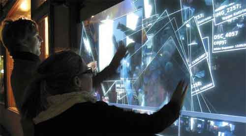
CityWall: Public, Collaborative Touchscreen

citysound.jpg

In Helsinki, a public, outdoor installation called CityWall allows multiple users to explore images and video tagged with "Helsinki" on Flickr and YouTube using a multi-touch interface.

The CityWall is designed to support the navigation of media, specifically annotated photos and videos which are continuously gathered in realtime from public sources such as Flickr and YouTube. To contribute content to the CityWall please send pictures and videos via MMS or email to post@citywall.org. Alternatively, tag your media on YouTube or Flickr with 'Helsinki' and we will pick up your media and display it here on the CityWall.

[via New Media Initiatives Blog]

Inexpensive Dual Head (or Tri Head) Monitor Setup

Matrox has a new dongle that takes the VGA output from a desktop or laptop computer and splits it into two DVI outputs running at 1920x1280 each. This could either trick a single-head Windows or Mac into running two displays or an existing dual head setup (like most Macs) into running three displays. That's a lot of pixels for a (relatively) low cost.

Only $229 (plus, obviously, the cost of the monitors).

[via Gizmodo]

LifeHacker Workspace Contest Finishes

Lifehacker winds up the last week of entries to its Coolest Workspace Contest. Included in this installment are workspaces for music composing and a portable workspace.

[via Lifehacker]

"Imagine a world of no more privacy"

Apparently this has been out for several years, but Katherine Albrecht and Liz McIntyre have a book on privacy versus RFIDs and other increasingly prevalent data gathering and location tracking technologies. It's called Spychips: How Major Corporations and Government Plan to Track Your Every Purchase and Watch Your Every Move [amazon link]. Just because you're paranoid doesn't mean they're not after you.

[via Cool Tools]

May 19, 2007

The Buzz: Information Viz

The Buzz is an information visualization tool from researchers at Georgia Tech. The application runs on a secondary monitor as a peripheral awareness tool, taking data feeds from a variety of sources (scrapings from web pages, RSS feeds, etc.) and displaying them as information collages. (The website's running extremely slow right now, but the link above should give you access to a downloadable version and several conference papers about the application.

Getting In Touch WIth Your Inner Radioactive Child

babylamp.jpg

Genius Jones sells this odd baby lamp. Your choice of orange, green, or blue. A steal at $99. One can never have too many baby lamps.

May 17, 2007

On the Ephemerality of Digital Information

bag of tape

Digital information occupies a weird functional space in the information spectrum, turning a linear spectrum into a Möbius strip. Unlike earlier information storage media, digital information is easily copied and redistributed (a characteristic that has spawned a whole, massive new arm of intellectual property law). But unlike more physically tangible information storage media such as print or magnetic recordings (or socially shared memory in oral cultures, for that matter) digital media decay with frightening rapidity—both due to the relatively fast degradation of digital media (compared to earlier analogue media) and changes in digital media formats. I remember 8-inch floppy disks, but I wonder how many drives than can read them still exist?

Jim Barksdale and Francine Bateman at the Washington Post outline some of the challenges facing efforts to archive digital media. (Yeah, I know it seems like digital media should last forever—it's just one's and zeros. But CDs and DVDs are, due to their commodity status as economic products, usually not all that stable over time. See this Datacloud entry from a few years ago.)

Current estimates are that in 2006, 161 billion trillion bytes -- 161 exabytes -- of digital data were generated in the world -- equivalent to 12 stacks of books reaching from the Earth to the sun. In just 15 minutes, the world produces an amount of data equal to all the information held at the Library of Congress. While it is unrealistic to think that we will be able to preserve all the data produced solely in digital form, NDIIPP convenes top experts to help decide which at-risk content is most critical and how to go about saving it.

Responsible preservation of our most valued digital data requires answers to key questions: Which data should we keep and how should we keep it? How can we ensure that we can access it in five years, 100 years or 1,000 years? And, who will pay for it?

The importance of developing sensible plans to preserve our digital heritage cannot be minimized. We can't save it all, nor do we want to. It's also critical that we agree on how to save this data. In the next 100 years, we will go through dozens of generations of computers and storage media, and our digital data will need to be transferred from one generation to the next, and by someone we trust to do it.

[via the Association for Recorded Sound Discussion List]

Smithsonian Images and Fair Use

Carl Malamud at Public Resource discusses a project that explores (and, to some extent, clears up) the complex claims of copyright that the Smithsonian makes for images at SmithsonianImages.SI.edu. (US IP law says that images taken by Smithsonian employees paid with federal funds cannot be copyright; the Smithsonian is trying to claim otherwise.) Among other things, Public Resource has downloaded all of the images from the Smithsonian site and then uploaded them to Flickr.

We have three goals in diffusing this knowledge:

  1. The unwieldy archive of low-resolution images on the Smithsonian site makes it hard for people to ascertain the public domain status of the vast majority of these images. By placing the database on sites such as Flickr and in convenient-to-examine PDF and tarball formats, we hope that the Internet commnunity is able to form a better judgement.
  2. Some images are clearly in the public domain and of immense public importance. For these images, our nonprofit organization is attempting to systematically purchase these images and place them on the net for use without restriction.
  3. We would like to see the Smithsonian adopt a policy for on-line distribution that is much more closely aligned to their mission, focusing on vastly increasing the store of public domain materials available on the Internet.

Cool.

[via Boing Boing]

Pre-Recorded Music as Performance

Robert Henke covers the history and current state of pre-recorded music in live performance, from Siemen's (1955) synthesizer to laptop concerts:

Also a classic tape concert typically is annotated with some kind of oral introduction or written statement, helping the audience to gain more insight into the creation of the presented work. I find this kind of concert situation quite interesting and I think it still could serve as a model for today's presentation of various kinds of electronic music. However, while in the academic music world tape concerts are well accepted and understood, there seems to be a need for electronic music outside that academic context to be "performed live" and "on stage", regardless of whether this is really possible or not. The poor producer, forced by record labels and his own ego, or driven by the simple fact that he has to pay his rent, has to perfom music on stage which does not initially work as perfomance, and which has never been "performed" or "played" during the creation at all.

When listening to one of those more or less pre-recorded live sets playing back from a laptop, we have almost no idea of how to evaluate the actual perfomance, and we might want to compare a completely improvised set (which is indeed also possible now with a laptop if you accept reduced complexity of interaction) with a completely pre-recorded set. We have no sense for the kind of work carried out on stage. What we see is that glowing apple in the darkness and a person doing something we cannot figure out even if we are very familiar with the available tools. This scenario is not only unsatisfying for the audience but also for the performing composer. The audience cannot really judge the quality of the performance, only the quality of the underyling musical or visual work, but it might be fooled by a pretentious performer, might compare a complete improvised performance, full of potential failure, with a presentation of a pre- composed and perfectly well-balanced work - without being able to distinguish the two. Also the performer himself might want to be more flexible, might want to interact more, or at least might feel a bit stupid alone with his laptop on a 15 meter long 5 meter deep stage with the audience staring at him, expecting the great show which he will not deliver.

All of which highlights the degree to which, for most people, interpreting and enjoying a performance relies heavily on evaluating the skills of the performer, rather than appreciating the music itself. Which isn't an incorrect interpretation, but only one of many.

[via precious | weblog]

Weblogs, Tech News, and $4,000,000,000

Gizmodo discusses an Engadget report (later retracted) about delays in Apple's release date for the iPhone and the next version of OS X. According to Gizmodo, Engadget's report was enough to cause Apple's stock to fall by 3%—$4 billion. Gizmodo avoids pointing fingers, but uses the incident to discuss its recent efforts to learn from the incident. It's not as if traditional media haven't committed worse blunders—but the point is to learn from them. And in this case, (some of ... well, at least a small subset of) the MSM can offer some lessons.

Gizmodo has an update, some commentary, and a link to Engadget's response to the issue.

[via Gizmodo]

May 16, 2007

Synaesthesia via Augmentation

At Wired, Sunny Bains reports on people who have developed technical means for experiencing synaesthesia, the cognitive condition that results in sensory input crossing boundaries from one sense to another (specific numbers being imbued with colors, odors being experienced as shapes, etc.). In this section, Bains uses a device that translates visual input from a camera into electrical impulses received by the user's tongue:

I could see it. Feel it. Whatever [...] With Arnoldussen behind me carrying the laptop, I walked around the Wicab offices. I managed to avoid most walls and desks, scanning my head from side to side slowly to give myself a wider field of view, like radar. Thinking back on it, I don't remember the feeling of the electrodes on my tongue at all during my walkabout. What I remember are pictures: high-contrast images of cubicle walls and office doors, as though I'd seen them with my eyes. Tyler's group hasn't done the brain imaging studies to figure out why this is so — they don't know whether my visual cortex was processing the information from my tongue or whether some other region was doing the work.

[via Boing Boing]

May 15, 2007

Ten Color Basics

At HGTV's website (I don't watch that channel, I swear), interior designer Marc McCauley provides ten basic color rules. They're explained in the context of interior design, but as McCauley points out, most of them are much more widely applicable. Explaining the 60-30-10 rule, he says,

When you think about it, this color breakdown is similar to a man’s business suit:

60% of the outfit's color is the slacks and jacket
30% of the outfit's color is the shirt
10% of the outfit's color is the tie

[via COLOURlovers]

May 14, 2007

Band Name Etymologies

Wikipedia has a long, alphabetized entry covering the etymologies of various band names. Here are a few (of the hundreds listed):

Fountains of Wayne — Named after a New Jersey lawn ornament store.
The Gun Club — singer Jeffrey Lee Pierce and his friend, Keith Morris (not a member of the band), sought a band name with Old West associations.
Hot Water Music — the band was named after Charles Bukowski's 1983 collection of short stories highlighting the underbelly of America.
Modest Mouse — Derives from a passage from the Virginia Woolf story "The Mark on the Wall". The passage said "...and very frequent even in the minds of modest mouse-coloured people..."

[via The Morning News]

The Collapse of History, Space, Time, Privacy, and More

SF author Charlie Stross has a great riff on how increases in bandwidth and storage are accelerating the informational/experiential compression of, well, nearly everything. (This is the exact same quote that boing-boing used, but it's the best in terms of the sort of research/thinking I'm doing. But read the whole article—it's full of useful background info and logic, including the hypothetical fact that 25 grams of synthetic diamond could store 6 year's worth of lifestream data for everyone in Germany.)

10Tb is an interesting number. That's a megabit for every second in a year — there are roughly 10 million seconds per year. That's enough to store a live DivX video stream — compressed a lot relative to a DVD, but the same overall resolution — of everything I look at for a year, including time I spend sleeping, or in the bathroom. Realistically, with multiplexing, it puts three or four video channels and a sound channel and other telemetry — a heart monitor, say, a running GPS/Galileo location signal, everything I type and every mouse event I send — onto that chip, while I'm awake. All the time. It's a life log; replay it and you've got a journal file for my life. Ten euros a year in 2027, or maybe a thousand euros a year in 2017. (Cheaper if we use those pesky rotating hard disks — it's actually about five thousand euros if we want to do this right now.)

Why would anyone want to do this?

I can think of several reasons. Initially, it'll be edge cases. Police officers on duty: it'd be great to record everything they see, as evidence. Folks with early stage neurodegenerative conditions like Alzheimers: with voice tagging and some sophisticated searching, it's a memory prosthesis.

Add optical character recognition on the fly for any text you look at, speech-to-text for anything you say, and it's all indexed and searchable. "What was the title of the book I looked at and wanted to remember last Thursday at 3pm?"

Those "edge cases"—people who want lifestreams as well as those under surveillance—mean that a huge amount of money is going to dumped into developing this tech.

[via Boing Boing]

May 13, 2007

Thirteen Ways of Looking at a Typeface

At Design Observer, Michael Beruit (who knows what he's talking about) offers thirteen ways of looking at a typeface.

9. Because it's ugly.
About 10 years ago, I was asked to redesign the logo for New York magazine. Milton Glaser had based the logo on Bookman Swash Italic, a typeface I found unimaginably dated and ugly. But Glaser's logo had replaced an earlier one by Peter Palazzo that was based on Caslon Italic. I proposed we return to Caslon, and distinctly remember saying, "Bookman Swash Italic is always going to look ugly." The other day, I saw something in the office that really caught my eye. It was set in Bookman Swash Italic, and it looked great. Ugly, but great.

May 12, 2007

Cultural Differences Among Emoticons

Behavorial scientist Masaki Yuki noticed some interesting differences between American and Japanese emoticons:

[W]hen Yuki entered graduate school and began communicating with American scholars over e-mail, he was often confused by their use of emoticons such as smiley faces :) and sad faces, or :(.

"It took some time before I finally understood that they were faces," he wrote in an e-mail. In Japan, emoticons tend to emphasize the eyes, such as the happy face (^_^) and the sad face (;_;). "After seeing the difference between American and Japanese emoticons, it dawned on me that the faces looked exactly like typical American and Japanese smiles," he said.

Eventually, he decided to do some research. His research team asked Japanese and American students to rank computer-generated emoticons on a happiness/sadness range; his suspicions about the importance of eyes versus mouth shapes for the two groups seem to confirm his early observations.

[via Boing Boing]

May 09, 2007

Corporate Ipsum Dashboard Widget

Corporate Ipsum is a Dashboard (OS X) widget that creates Lorem Ipsum-style text, except in corporate buzzword-speak. (Even better, the widget will also create standard Lorem Ipsum if you need it, let you set the number of sentences per paragraph, and insert HTML between paragraphs.)

Synergistically engage cross-media human capital for out-of-the-box convergence. Objectively generate fully tested meta-services via market-driven sources. Interactively underwhelm long-term high-impact convergence rather than future-proof convergence.

The hyphens detract somewhat for the potential use as placeholder text in design mockups, but it's worth a shot. Also a useful way to generate 20 pages of meaningless faux weighty, substantial text for the report you know your boss is going to quit reading right after the Executive Summary section.

[via 43 Folders]

May 08, 2007

Convention Report Writing Tool

convention.jpg

The Morning News has a fill-in-the-blank template for generating news articles about conventions and subcultures.

May 07, 2007

Mental Health Day

Flow

Not getting much done in the way of work today. Technically, I'm "testing" new camera equipment for a documentary/research project. Which translates to, "Going outside and taking pictures of things."

Storytelling in Videogames

Ars Technica has the first part of a short series on the importance of storytelling and writing in videogames.

The problem with writing in games is that we point out when it's terrible, but we don't praise it enough when it's good. Consider Half-Life 2.

In the beginning of the game, you're just another desperate citizen pushed through processing before entering the city. People around you are muttering, and if this is your first time playing, you'll likely amazed by the graphics and the Source engine. It's beautiful. Then the megascreen on the building pops up and Dr. Breen appears to explain why the aliens have taken away our ability to reproduce. The quality of the writing makes it worth quoting at length:

Let me read a letter I recently received. "Dear Dr. Breen. Why has the Combine seen fit to suppress our reproductive cycle? Sincerely, A Concerned Citizen."

Thank you for writing, Concerned. Of course your question touches on one of the basic biological impulses, with all its associated hopes and fears for the future of the species. I also detect some unspoken questions. Do our benefactors really know what's best for us? What gives them the right to make this kind of decision for mankind? Will they ever deactivate the suppression field and let us breed again?

[via Ars Technica]

May 04, 2007

Microsoft's DataDesk Demo

Microsoft's (still in development, but demo-able) DigiDesk. Large touchscreens, built-in scanner w/OCR, etc. Not dramatically innovative in terms of HCI, but interesting to see in development. (Microsoft is pitching this, at least in this demo, as a business management tool, but it'd be interesting to see how this tech might play out for other forms of knowledge work—music or video editing, research, scientific visualization, etc.

[via Gizmodo]

PS3: Little Big Planet

Looks like someone's finally starting to use the full processing power of the PlayStation 3. Here's a demo reel (from GDC07) of Little Big Planet. Wow.

Check the post at Precious for some additional images and footage.

[via precious | weblog]

May 03, 2007

Multiple Monitors

monitors.jpg

Lifehacker posts some reader images of multiple-monitor setups, including Andrew Mitry's desk with OS X on the left, Ubuntu on the two middle, and Windows XP on the right.

[via Lifehacker]

John Cage: Water Walk (vintage TV)

From WFMU, a youngish John Cage on the gameshow I've Got a Secret performs Water Walk with bathtub, blender, five unpowered radios, a blender, and more. (The radios weren't plugged in, according to the host and Cage, due to a union dispute about which crew could handle the radios.)

[via Your Daily Awesome]

Thoughtcrime: The Other Shoe Drops

A Houston-area student at Clements High School was arrested and later banned from attending graduation after creating a map for a videogame (apparently a "level" for a game like Quake, which is basically just a 3D architectural view of a building) based on his high school's layout:

The map the boy designed mimicked Clements High School. And, sources said, it was uploaded either to the boy’s home computer or to a computer server where he and his friends could access and play on it. Two parents apparently learned from their children about the existence of the game, and complained to FBISD administrators, who investigated.

“They arrested him,” Chen said of FBISD police, “and also went to the house to search.” The Lin family consented to the search, and a hammer was found in the boy’s room, which he used to fix his bed, because it wasn’t in good shape, Chen said. He indicated police seized the hammer as a potential weapon.

[...]

Speakers at the FBISD Board’s April 23 meeting alluded to the Clements senior’s punishment, and drew a connection to the April 16 shootings at Virginia Polytechnic Institute, in which a Korean student shot and killed 32 people.

[via Slashdot]

On the Tenure Track

I learned all these lessons quite a while ago, but I only ever passed them on over email or conversations—Cheryl Ball and Kristin Arola have an excellent piece, A Conversation: From 'They Call Me Doctor?' to Tenure at C&C Online. Their experiences are in composition jobs, but most of these would be useful to any new tenure-track faculty member in any discipline. Includes sage advice from many other people as well (including Clancy Ratcliff, who I cribbed this entry from).

10. Learn to say no! I know, how many times have you heard this one?! But it’s so true. Since becoming a faculty member, I’ve had to say no to committee work, lab and writing program administration, some work with Kairos, irregular teaching assignments, and even several research/publication opportunities. As my tenure committee told me, “You just can’t do it all.” Remember that your ‘job’ in a tenure-track position is TO GET TENURE. Don’t do anything that doesn’t move you forward within that system. Of course, that’s just my advice. Others will say that you should do whatever you want, and that you just have to make it fit within your tenure narrative. Or, they’ll say, do it because you want to. That’s fine advice, too, and it’ll be your choice once the time comes to say no.

At some point in the first few years after I finished my PhD, I realized I'd finally really finished being a student when I declined a project my grad-school mentor (also one of Cheryl's grad-school mentors) encouraged me to take on. You'll have to dig around on the site a little, but it's worth it.

[via CultureCat: Rhetoric and Feminism - Clancy Ratliff's weblog]

May 02, 2007

Methinks Thou Dost Protest Too Much

From a spam message I received today, advertising a product to increase a portion of my anatomy:

See WWW # [SITENAME] # NET. Replace # with .

This is like a rattlesnake trying to avoid being bitten by other rattlesnakes. (I had to remove the original sitename because I started getting hit by bots searching for that URL. Which, to run the metaphor into the ground, is like picking up a two-headed rattlesnake to show it to someone and getting bit. Twice.

May 01, 2007

The Index Card Internet

mundaneum.jpg

The Proceedings of the Athanasius Kircher Society (possibly the best name for a weblog, ever) has a history and images of Mundaneum, the Index Card Internet

(All of which seems quaint, but calls into question exactly how much of the world's knowledge is actually currently available to us now, on the web. There's the sense that if something doesn't have a URL, it's not real. If pressed, most people would admit that's not true, but people around me operate as if it's true in most cases. But check this Internet World Stats page (a marketing research site, but roughly similar to other sites I looked at). Penetration of the Internet by percentage is, well, non-ubiquitous. Around 70% in North America, 50% for Australia and associated countries, a little under 40% in Europe, and it drops after that (only 3.6% in Africa).)

[things magazine]

Some Short Histories of "Standard" Colors

Colourlovers weblog has some brief cultural histories of popular "standard" colors, offering historical reasons for how some colors became defaults for specific meanings: Pink for boys, red for girls; republicans red, democrats blue; white flag for surrender, etc. Here's an entry for "red = stop" (along with "green = go" and "yellow = caution"):

Stop signs originated in Detroit, Michigan in 1915. The first had black letters on a white background and were somewhat smaller than the modern one. In 1924, the sign changed to black on yellow. In 1954 the US Federal Highway Administration (FHA) published the The Manual on Uniform Traffic Control Devices (MUTCD). It was in this manual that the stop sign was standardized as red with white type.

(These are not definitive histories, btw—citations to sources are offered for most, but they're mostly to single websites.)