« December 2006 | Main | February 2007 »

January 30, 2007

Love is a Mix Tape

Keith Harris reviews Rob Sheffield's mixtape-chronicled ode to his departed wife, Love is a Mix Tape. I haven't read Sheffield's book yet, but Harris' review makes it sound deeply interesting:

On his blog, New Yorker pop music critic Sasha Frere-Jones has wondered when someone will title a review of Love Is a Mix Tape "The Year of Musical Thinking." And true, as with Joan Didion's compressed tour of Stygian dementia, Sheffield analyzes how death alters your consciousness, though with much deeper insight into the mystery of Missy Elliott's "The Rain (Supa Dupa Fly)." And death lurks throughout Sheffield's '90s, as indicated by his brilliant reading of Nirvana's Unplugged—"Contrary to what people said at the time, [Kurt Cobain] didn't sound dead, or about to die, or anything like that. As far as I could tell, his voice was not just alive, but raging to stay that way." (Just as pertinent is an aside that Renee thought "Heart-Shaped Box" ripped off Blondie's "Call Me." It did. Never thought of that.)

(Oddly, I heard "Heart-Shapted Box" on the radio this afternoon on the way back from Burlington.)

[via Fimoculous.com]

January 28, 2007

Good Design

Usability guru Don Norman's weblog has a page dedicated to examples of good product design. I don't always agree with Norman's work on design, but I usually do. And his picks are no exception. Teapots, staplers, alarm clocks, coffee cups, and more.

[via Beyond the Beyond]

January 26, 2007

Architecture in QuickTime VR

Columbia University's Real?Virtual has an impressive set of QuickTime VR architectural shots and interactive plan views from various historical/cultral works, including a first-century Roman ampitheater in Sicily, Le Corbusier's Church of Notre Dame du Haut, Frank Lloyd Wright's Fallingwater, and the Shehzade Mosque in Istanbul. Site navigation is a little wonky, but worth exploring.

[via things magazine]

January 25, 2007

Many Eyes: Information Visualization

dataviz.jpg

The IBM Visual Communication Lab has released an alpha version of Many Eyes, a public, shared visualization tool. You can upload datasets, create visualizations, share them, and post comments.

(I grabbed this from information aesthetics, which has links to several other free visualization tools.)

[via information aesthetics]

January 24, 2007

Graphs are the new narratives

isthenew.jpg

Leisure Arts has a nice chart documenting uses of "x is the new y" from (unspecified) media sources. A small chunk of it's shown above.

[via Noisy Decent Graphics]

January 23, 2007

Urbanity, Virtuality, Architecture

Pop-Up City at studioPoPcorn riffs on the connections between virtual and urban living in a series of short meditations on multimediality, virtuality, connectivity, and more.

Interactivity

Being in the city means having a continuous interaction with our environment. Interactivity has become our very essence. New York rap star Fat Joe has been wrong all the time when he said we should all ‘lean back’. Now, we lean forward – over our keyboards, cellphones and game-consoles – embracing technology in a post-paranoic state of mind. No mobile phone: no business. No laptop: no friends. We have to look for points where closed structures are combined with each other. The urban appears in nodes where systems move into one and other; a void in which closed structures open up. Always related to a three-dimensional space, interactivity marks the very access point of urbanity. It is an entrance to different spatial settings, spheres or virtual neighbourhoods. Urbanism now means interactive systems are mutually influencing each other. It shows how they are detaching themselves from their physical context to start to function independently. Therefore interactivity should be approached in relation to a social context. In that way, architecture will be a connection that allows us to move from one closed off environment to the other. Refraining some and allowing other people access to a certain point will become the most important function of architecture in this version of the future.

[via things magazine]

Fluid Time

I stopped wearing a watch or paying much attention to the clock a decade or so back, but I still like the idea of this Procrastinator's Clock (available for Mac, Win, and as a web app), designed by David Seah.

Enter the Procrastinator’s Clock. It’s guaranteed to be up to 15 minutes fast. However, it also speeds up and slows down in an unpredictable manner so you can’t be sure how fast it really is. Furthermore, the clock is guaranteed to not be slow, assuming your computer clock is sync’d with NTP; many computers running Windows and Mac OS X with persistent Internet connections already are.

So why go through all this trouble to make a clock that’s sometimes fast and sometimes not? FEAR, UNCERTAINTY and DOUBT, my friends! If you use this clock to keep appointments and deadlines, and you really care about being on time, you have to assume that the clock might actually be telling the correct time though it’s likely to actually be up to 15 minutes fast. Yikes! All that anxiety should give you a good kick in the pants to get moving, because you can’t really trust the clock to be anything but on time, even though it probably is fast.

The banner for David Seah's website also prominently features a bottle of Knob Creek, which is always a telling sign of an inveterate procrastinator.

[via Lifehacker]

January 21, 2007

On My Desk

gibson.jpg

On My Desk gathers images and narratives from artists and other "creative folk" (their term, but I guess it works) showing their workspaces. Above image is from a post by Dallas artist Geoff Gibson:

I've been crafting this mess for about four years and feel it could only be better in a tree on a beach. the clutter is key to my workflow. I'm easily bored and quickly disinterested in things going too well or in need of finishing. the visual noise keeps my eyes darting and mind popping as i drift away. the reference books and multiple on-going projects give me things to do while avoiding things I feel I should be concentrating on. thus i make scattered-but-steady unintended progress despite my laziness and lack of focus. this is my zone.

Some of these are extremely interesting (at least if you're interested in the kinds of things I'm interested in).

[via email from Anne]

Public Domain Images

As a followup to last week's post on free, re-usable clipart and stock photography, here's Lifehacker's list of six ways to find public domain work (images, video, audio, etc.) you can (legally) use without paying royalties. The list includes both primary sources (such as CC's list of songs licensed for mixes) and strategies for finding images and documents using Google. Cool.

[via Lifehacker]

Designer is the New DJ

Grooveeffect looks at smallscale, web- and computer-enabled DIY clothing design and street culture and suggests that "the designer is the new DJ":

‘Street culture’ is the latest trend bubbling up from the underground, but you don’t need me to tell you that. This site is a testament to that, as are the dozens of other sites, blogs, and forums that spread news on the scene. The art, the fashion, the accessories – it’s everywhere. Fixie bikes are blowing up. Luxury streetwear is blowing up. Sneaker culture is blowing up. Graffiti culture is blowing up. Skating is blowing up (again).

The argument makes sense, particularly in areas of design that rely heavily on remixing (of which street culture is one). Adam Koford's "Have a Nice Che" t-shirt, featuring the icon smile face on the just-as-iconic Che image, for example, utilize standard images, a little computer image combination, and one of many websites that offer production and distribution facilities for micro-run items.

che.jpg

I'm not one of those who believes strongly in that whole "The Internet Democratizes Everything Completely" story. Having access to a printing press doesn't make you an author—there are still numerous forces that strongly determine what is popular, and access to publishing isn't a panacea. Big media, for example, still has a strong hand in structuring popularity (even for DJs). Access to the web opens the fashion industry to anyone—but you have to supply your own design smarts. Still, this does open up new possibilities for many people.

[via The Mediaburn Radio Weblog]

January 20, 2007

Compendium of Public-Domain Image Links

Nonpartisan posts a list of links to public-domain and CC-licensed image collections. Some of these were new to me. Licenses at the sites vary, so check specifics. (And be sure to check the comments section for additional links, such as the always useful morgueFile.)

[via Daily Kos]

Organizing Workspace

before.jpg

(This isn't my workspace.) Noisy Decent Graphics publishes before (see above) and after images of getting their desktop organized. An admirable job.

In my own workspace, I only take this sort of deck-claring organizing work every four or five months, and it usually involves putting sixty or eight books back on the shelves, tossing out seven or eight pounds of printouts that I thought I might need (and never did), and stacking all those external hard drives back up (I have four, all oriented vertically to the right side of my desk, and they tend to tip over when I stack papers up on them).

I save this activity for launching major things—the drafting stages of a new project (after having completely destroyed my office during the massive information-gathering phases that always precedes writing for me), or the start of summer break.

For me at least, this massive organization impulse is a delicate thing. There's some level of mental activity I need to have worked through—slightly more information than I can handle, sustained over several months. And then an impending need to clear my mind and hold as much information in as I can, over an equally long amount of time to actually put some of the ideas down into tangible/visible form. If I do it too frequently, I can't find things—I don't have a formal organizational system, but I remember where things are stacked in visual images I have in my mind. So clearing the decks before a new project tends to simultaneously clear my mind of other things, but also push all those other things—some of which are periodically important—off into the margins. I'm not at the borders of anything major right now, so my desk still looks more or less like the image I posted last month. (Actually, a little more crowded with papers, cables, and books. And I still haven't quite recovered from writing the last book, so my walls are still filled with notes and quotes I drew on them in whiteboard marker when I was starting Datacloud. I think I'll have to crack open a can of paint to clear that out.)

January 19, 2007

Architecture & Criticism

Johnathan Glancey has an interesting meditation on the symbiotic connection between architects and critics at Guardian UK. He makes some points (as you might expect) that are relevant to any complex design work—software, products, cooking—that people actually use:

[A]rchitecture is a process. The critic is a part of that process, too, and always has been. Even if negative, criticism plays its part in the course of architectural thinking. There are critics who love to be an intimate part of the architectural process and who might well be good friends with the architectural profession. Equally, there are those who are largely detached from everyday professional concerns, yet who make architects, and those who experience their buildings, think in ways outside their own approaches and prejudices.

[via things magazine]

January 18, 2007

Tokyo HDR Shot

tokyo.jpg

I've had to extremely downsample this to make it fit (in terms of both size and compression), but you should check out this HDR (High Dynamic Range) cityscape of Tokyo in the largest size your monitor will allow. It's the closest thing to a Bladerunner shot I've seen in a long time.

HDR shots involve taking multiple shots of a scene, stepping up and down the exposure by several notches for each shot, then combining them all to give a wider range of exposures in a single shot. You can see more examples of the technique at the Flickr HDR Pool.

[via Gizmodo]

Graffiti Removal

graffiti.jpg

Artist/provateur Banksy has published a handful (actually, two hands' full) of images of his work for download at his website, including versions of each in 1600x1144 or larger resolution.

Serving suggestion:
Prints look best when done on gloss paper using the company printer ink when everyone else is at lunch.

His stuff just cracks me up.

January 16, 2007

Understanding Comics Recursion

The weblog Drawn! points to a 37 Signals discussion of Scott McCloud's Understanding Comics.

I read Understanding Comics several years ago, on the advice of a videogame designer. I was a little skeptical, but McCloud's analysis of how comics work is remarkably insightful about communication in general: not just in how things are created, but how to design things that people can engage with. We're using the text in my Narrative for New Media course this semester; we're just starting, so I'm not sure how it will go, but the students said it looked interesting.

January 15, 2007

Workspaces for Gamers

Kotaku posts images from the game rooms of five hardcore players. Sort of frightening in its range of obsessiveness (some due to the meticulous arrangement of monitors and high-end seating, others due to the anit-meticulous arrangement of empty Coke bottles and food containers). "Game" is probably an inappropriate term here; "lifestyle" would be more accurate.

[via Kotaku]

Second Life Architecture

sl-arch.jpg

Archinet is running a long article (with extensive supplementary links) that discusses architecture in Second Life, including the overwhelming predominance over very conservative architecture in SL. What happens when you give people tools that will let them building wildly experimental spaces? Most of them seem to build versions of upscale homes they see in the media. (Not that this is a surprising or even evil trend—it's just sort of odd.) Here's a short snip from the section of the article based on an in-world interview with architect Tor Lindstrand, founder of LOL Architects ("the world's largest virtual architecture firm"):

I think that we live in a world where the production of desire has been completely overtaken by market economy, and this is manifested so much in Second Life. I guess it shows that the major influence in thinking about architecture today is more through other media than through architecture itself. Rather than spatial experiences, it is much more about images, television, movies, games. I'm interested in how the image of architecture is so dominant in platforms like Second Life and how this relates to how the image is becoming more and more dominant in contemporary architecture, how we consume architecture as much through Hollywood, expensive coffee table books and tourist information as we do through spatial experiences.

[via Fimoculous.com]

January 13, 2007

Diagramming Sentences: Post-Pedagogical

Michael Erard at Design Observer discusses the aesthetics of sentence diagramming. Erard admits that the practice has long been shown to have little effect on learning grammar or writing, but he still finds a place for it:

But diagramming is kinky because it forces the structure of language to wear the clothes of images. A sentence diagram is less a map than a portrait, and in this vaudeville language is painted, corsetted and trussed.

The piece also includes a graphic of one of Groucho Marx's puns, a brief history of sentence diagramming, and nuns.

[via Design Observer]

Gen Next: Social Gaming and Ethics

Clickable Culture points to a new Pew Research report on "Generation Next [PDF]" ("Generation Next" is apparently 18-25). The report's pretty wide ranging: 1. Outlook and World View, 2. Technology and Lifestyle, 3. Politics and Policy, and 4. Values and Social Issues. Most of the news I've read on this focuses on tech issues, such as this:

69% of Gen Nexters say new technologies make it easier to make new friends, compared to 53% of Gen Xers.
86% of Gen Nexters are at least occasional internet users, compared to 91% of Gen Xers, 73% of Baby Boomers, and 46% of Seniors.
51% of Gen Nexters say they sent or received an instant message in the past 24 hours, compared to 22% of Gen Xers.
54% of Gen Nexters have used a major social networking site such as MySpace, 38% say they use it once a day, 38% say they use it once a week. 44% have created a social site profile.
49% of Gen Nexters say they play console-based videogames, compared to 35% of Gen Xers, 13% of Baby Boomers, and 3% of Seniors.
36% of Gen Nexters say they've played videogames in the past 7 days (of that 36%, 51% were males).

But I noticed this fairly troubling chart:

gennext.gif

So, Generation Next is much more interested in making friends online, way likely to communicate online, and plays videogrames. And is majorly profit-driven, fame-driven, and less likely to help people out, be a leader in their community, or feel spiritual. Damn, the luddites were right

[via Raph Koster's Website]

January 12, 2007

FedEx Bans Shipping Containers of Air

A graphic artist attempts to ship (among other things) some empty packaging samples to a potential client. Many of which contain air. Homeland Security paranoid hilarity ensues:

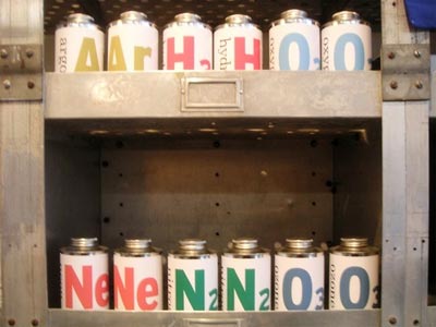
The FedEx guy then grabs cans of nitrogen (N2) and neon (Ne), with their store-advertised "purity" of 78.084% and 0.0018% respectively (which was our way of being clever about selling cans of normal air, since that's their percentage in the atmosphere—which, of course, was our way of making more money for 826 Seattle by selling products that cost almost nothing to produce). Here's what the atmospheric gas cans look like on the shelf:

air.jpg

FedEx guy: Nope. You can't ship these either.

Me: But... they're empty! It's just air. And... nitrogen? It's, like, almost 80% of the atmosphere. There's nothing dangerous about nitrogen, even if it were pure. FedEx guy: They look too much like bomb-making materials.

Me [going into dumbfounded mode]: Bomb... Neon? What? Is there anything here I can legally ship? How about this bottle of tap water?

I hand him a bottle of Certainty (tagline, "For when it's preferable to think you know more")[...]

FedEx guy: Nope. It still looks too suspicious, too much like bomb-making materials.

Me: But it's "Certainty." That's not even a thing. I just made that up. [That's not strictly true. It's a scientific term/idea, and we sell it alongside bottles of "Uncertainty." But it's like having a bottle labeled "Friendship."] FedEx guy: It's just too suspicious.

(826 Seattle, namechecked above, is part of David Eggers' nonprofit community writing center network, which everyone needs to support, 826 National.)

[via Boing Boing]

Media Diary

I mentioned media diaries a day or so back. I've assigned projects like this to students in my mass media classes; they're probably useful in any course where you'd like students to understand the sheer volume of media they consume on a daily basis. As you can see from the assignment notes below, one challenge is in getting students to actually pay enough attention to this stream of messages. (Feel free to use the assignment in your classes. See CC license info at the end.)

24-Hour Media Diary

Nearly everyone in our culture is swamped with media. Billboards, TV shows, magazines, flyers on bulletin boards in hallways, logos on T-shirts, videogames, websites, textbooks, PowerPoint presentations, and more.

At some point during the next week, I'd like you to keep a media diary for a single, 24-hour period. In that diary, you should note as many of the media messages you receive, with entries for the media type, timeframe, and content. After you've completed the diary, you should write a 1,000-word analysis and reflection on your experiences using theories and research we've discussed in the course.

Media Diary Format: You'll need to carry a small notebook with you during the day. Sketch out vertical columns in the diary so that you can make entries for time start, time end, media type, and media description. You don't need to be obsessive about the entries—if you listen to Internet Radio for forty minutes, you can just list the radio station/genre you listened to, not every song. If you pass a bulletin board with twenty fliers from campus groups on it, you don't need to specify each one. You should keep the diary on an "average" day for you—when you're out in society—not when you're camping deep in Adirondacks. I'll have a hard time believing that you don't see/hear at least a few hundred media messages a day, if you're an average US university student, so your diary needs to include at least a minimum of 40 entries. If you surpass 60, you can stop for the day (I would think you could get more, but by then, you should have gotten the point of this assignment).

You'll need to pause at least every 30-60 minutes or so to make entries in the diary. (I don't expect you to hold the notebook on your steering wheel to write down ads on the sides of city buses you pass, but don't wait until the end of the day to try to remember everything you saw.)

Analysis: A day or so after you finish your diary, read back through your diary and reflect on your experiences. What sorts of messages did you actually pay much attention to? What messages had some sort of effect on you, interested you, or amused you? Did the messages seem directed to you, or to someone else? Also, spend some time trying to connect your experiences up with our course content. Do the different theories we've discussed in class seem to explain or predict what you experienced? Why or why not?

Creative Commons License
This work is licensed under a Creative Commons Attribution-Noncommercial-Share Alike 2.5 License.
Airports, Architecture, and Subjects

naked-airport.jpg

Air travel used to be about the future, a heterotopia apart from the everyday, the space in which one magically moved outside space. See, for example, Alastair Gordon's wonderful history, Naked Airport:

It was my cousin's last day in America--August 26, 1964--and he wanted to see the World's Fair before flying back to London. My father drove us in his Buick to Flushing Meadow. The sky over Long Island was tempered blue and streaked with contrails. We bought tickets for General Motor's Futurama exhibit and rode around a miniature landscape that showed what life would be like in the future. My cousin and I were disappointed. There was something hoaky about the whole fair and the so-called future seemed frankly shabby.

After the fair, we drove south a few miles on the Van Wyck Expressway and reached the periphery of Idelwild, which is what my father still called the airport, although it had been renamed John F. Kennedy International the year before. We glided along freshly paved overpasses and beneath the signs bearing candy-colored numbers. The terminals were strung out like pavilions around the looping roadway and it felt as if we were back at the fair. There was the flashy stained glass entry to American Airlines, the flying saucer roof of Pan Am, and the endless glass facade of the arrivals building. Then we parked in front of the TWA terminal and walked inside.

I had seen photographs of the bird-like structure, but none had done it justice. The interior was a continuously flowing surface of cast concrete. There were no sharp corners, no right angles, no dull flat ceilings. The building was topsy-turvy--in some places the walls swooped down to become floor, while other parts curved above our heads like ocean waves about to break yet were somehow frozen in place. Between the vaults were gaping ellipses of glass through which you might see a tailfin or a passing cloud. I was only twelve and knew nothing about architecture, but the pavilions at the Worlds Fair seemed stodgy in comparison. This wasn't pretending to be the future; this was the future. Those were real Boeing 707's sitting on the tarmac.

The air was charged with anticipation. Pilots stepped through pools of milky light. Beautiful stewardesses trailed behind them wearing trim red outfits and perfectly straight stockings seams. The ambient lighting; the flirtatious smiles, the lipstick red carpet and uniforms; the cushioned benches and steel railings curving around the mezzanine--all conspired to work on the senses. Even the clock that hung from the ceiling had a sensually globular shape. We sat in an oversized conversation pit, beneath a panoramic screen of glass, and watched the service vehicles scoot between the planes. "This is unbelievably cool," said my cousin in a hushed, almost reverential tone.

Now we're just so many cattle that may or may not carry some sort of contamination.

tsa.jpg

Matt Blaze's Exhaustive Search weblog has a brief piece about the intrusiveness and awkwardness of airport security and architecture—and a link to the TSA Airport Security Guidelines [333-page PDF].

3. Sterile Area
At an airport with a security program under 49 CFR 1542, the "sterile" area of the terminal typically refers to the area between the security screening checkpoint and the loading bridge and/or hold room door. The sterile area is controlled by inspecting persons and property in accordance with the TSA-approved airport security program (ASP). The primary objective of a sterile area is to provide a passenger bolding and containment area....

A Boing-Boing post on Blaze and the TSA guidelines also links to Patrick Smith's Ask The Pilot article in Salon on the same topic, a piece that's funny and depressing at the same time:

Item 4 must be placed in separate tray, alone. Item 5 goes in a round plastic dish, also by itself. Items 1, 2 and 3 are piled together in a third tray. But not so fast, as a guard warns me not bury my shoes beneath the other items. He recommends I place them separately on the belt, or in yet another tray. So there I am, one person, with four separate trays of belongings. And after those belongings are X-rayed, it's time to:

1) Put my coat back on
2) Put my shoes back on
3) Repack the computer
4) Repack the approved, 1-quart-size zip-lock bag
5) Strap on my backpack

All of this with no chair or table, elbow to elbow with a dozen other people all doing the same thing. I'm trying to grab my stuff as more and more bins come clattering down the rollers. I can't find my shoes, and I have no idea where my passport is.

[via Boing Boing]

January 09, 2007

Media Diaries

NY Magazine asked three New Yorkers to keep media diaries for three days. Here's a day's entries for one (typical) participant:

7:30–8:30 a.m. “Morning Edition” (NPR) at home.
9–9:20 AM New York on subway.
9:25 AP and USA Today headlines on a screen in office elevator.
9:40–9:55 E-mail accounts (Gmail, work, NYU e-mail, Hotmail), Gawker.
1:20–4:30 p.m. Gawker, TMZ, “Rush & Molloy” online, Nytimes.com, Facebook, Google, Nysun .com.
5:30–6 iPod on subway: “London Bridge,” by Fergie; “Save Room,” by John Legend; “Steady, As She Goes,” by the Raconteurs; “Ain’t No Other Man,” by Christina Aguilera; “Plástico,” by Willie Colón & Rubén Blades.
7–8 iPod at gym: Ministry of Sounds Session, by Max Graham.
9:10–9:25 Gmail, AccuWeather .com at home.
10:45–11:30 Grey’s Anatomy on laptop (purchased on iTunes).

Which was notable for a couple of reasons. First, "media" here gets defined as "big media." I have my mass media students keep a media diary for a single 24-hour period, and they normally run 30 - 50 entries. In addition to about twice as many "big media" entries, they also track less monolithic media such as billboards, flyers, textbooks. As I say to my students, in a joke none of them get because they're not old, "You're soaking in it!"

But even weirder is that the diaries in NY Magazine only list a scant handful of websites. NY Mag's intro to the piece hypes these media consumers (and they're all consumers rather than producers, if the media diaries are to be believed—which is weird, given that the entries above are from a copy editor for a large, commercial magazine) as if they're on the cutting edge of Time's much-discussed "You" of the year. These people, though, seem relatively oblivious to the mediated world around them. Or maybe it's just me, being too mediated.

[via Fimoculous.com]

Anarchy, Control, and Collaboration

The weblog Architectures of Control discusses several approaches to automotive traffic management, including "shared spaces" approaches being adopted by some European communities that do away with signage. Surprisingly (especially if you're used to being explicitly told what to do by stop signs and direction arrows as you drive), removing traffic signs makes drivers act more, rather than less, responsibly.

One of the simplest consequences of the shared space situations I’ve come across (whether deliberately planned implementations such as at Seven Dials, shown above, or just narrow old streets or village layouts where traffic and pedestrians have always mixed) is that drivers and pedestrians, and drivers and other drivers start to make eye contact with each other to determine who should have priority, or to determine each other’s intentions. Eye contact leads to empathy; empathy leads to respect for other types of road users; respect leads to better understanding of the situation and better handling of similar situations in future. Shared space forces all of us (pedestrians, cyclists and drivers) to try to understand what’s going on from others’ points of view. We learn to grok the situation. And that can’t be bad.

This strategy has interesting implications for other social situations. Would this work in, for example, checkout lines in grocery stores? It's not uncommon to see someone with a cartload of groceries let the person behind them with a loaf of bread go first. But it's also not uncommon to see someone with twenty items get in the ten items or less line. And when I'm deciding whether or not to let the person behind me with way fewer items go ahead of me, I also ask myself why they're not in the correect line—the express lane. Would removing the explicit signs generate more empathy? Or more stupidity?

Results, I'm guessing, would fluctuate a lot. I've taught classes where the students responded to open structures very well, and I've taught classes where another group of students balked at assuming any responsibility for their own learning. And I'll be damned if I can easily predict which way it's going to go for a particular class.

To give your sheep or cow a large spacious meadow is a way to control him.

— Suzuki, Zen Mind, Beginner's Mind

[via Architectures of Control]

January 08, 2007

Location-Based Narrative

The Interpretive Engine tells a story in three chapters, one of which you can read online from anywhere; the other two must be read within range of a wifi connection at specific geographical locations (one in Santa Fe, the other in Fresno).

The early history of the telecommunications and transportation industries inspires this story, told by 6 characters. In the Industrial Era communications, navigation, and transportation systems existed side by side in an interdependent network. These technologies as well as the profound philosophical, theological, and social shifts that ushered them in figure prominently in this story.

Characters include The Hungry Ghost, who worked in the Bureau of Time and wanders between 1884 and the present; her Guardian; children contemplating the meaning of time and space, and a Narrator.

The characters are accessed through 1885 and 1950 maps of Fresno. You are represented in the middle of the map interface at all times by an asterisk-like symbol. Simply use the arrow keys on your keyboard to navigate around the map and trigger the characters in the story. Your symbol must collide with other Character symbols to trigger audio content. The various characters can be recognized by the icon representing them on the map.

[via things magazine]

January 07, 2007

Futurescapes of Work

Anab Jain interviewed people in the various "show us your workspace" groups on Flickr, then created composite fictional characters, jobs, and spaces in the world of 2012.

Alice now often visits one of the coldzones in Little Brinkland to work and meet people. Coldzones are physical, transient spaces where the digitally exhausted Brinklanders can go offline, and stay away from surveillance and constant tracking.

A short video and interview are available at onoffice.

[via anne]

January 05, 2007

Venn Diagram Jokes

parole.gif

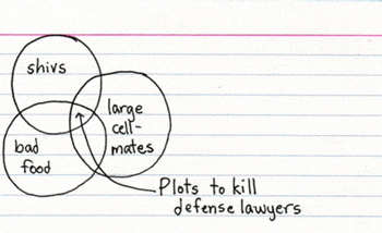
Jessica Hay has a weblog consisting entirely of funny Venn diagrams written on index cards. Which is a lot funnier than it sounds.

[via Boing Boing]

Boston at Night

seafood

Shot from the balcony of a Boston hotel in November. Actually looks better at medium sizes, because the autofocus on the Canon tracked on the buildings in the midground, rather than on the signs in the focal point. But I liked the colors in the shot.

January 04, 2007

How To Choose a Good Font

type.jpg

Typography has an extremely well-done explanation of typography basics, one of the best brief intros to type I've seen on the web. (There are better books on type—buy Bringhurst if you get serious about this. But this the best short web intro I've seen.)

All this stuff—counters, x-height, kerning—seems really mysterious and unimportant at first, but once you get through Typography's demo, you'll see how important all this stuff is; the scales on your eyeballs will fall, you infidels.

[via Lifehacker]

Archive: Skatepunk

thrasher.jpg

To commemorate their 25th anniversary, the long-running skatepunk magazine Thrasher is posting their first 12 issues (staring in December 1981) online.

Interesting reading whether you're a real skateboarder, a poser, or just watched one of the versions of Lords of Dogtown.

One of my earliest near-death experiences, from around 1975: Holding on the seatpost of my friend's Schwinn 10-speed while I crouched on skateboard just to the left of his rear wheel, as he pedaled up to 30 mph downhill on Walnut St. He pulled off to the right halfway down the hill and I went straight. At some vague point just before the bottom of the hill, I hit a piece of gravel and the board (now far behind me) stopped abruptly. I ran as fast as my little legs could carry me, my nose about eight inches off the ground, for fifteen feet before I went down and ground asphalt through the shirt on my back for an additional ten feet. I ended up on my back bleeding, laughing, and crying about five feet short of rush hour traffic on Michigan Ave. Halfpipes? Who needs halfpipes when you have sheer clumsiness and stupidity for excitement?

[via Boing Boing]

January 03, 2007

Forgoing User Testing on the OLPC

A Yahoo News article about the One Laptop Per Child project seems to suggest that the interface for the $100 (ok, $150) computer (a) is a completely new, very powerful interface design unlike existing models such as Mac, Windows, or Linux UIs, and (b) was designed without input from users such as children.

Wayan Vota, who launched the OLPCNews.com blog to monitor the project's development because he is skeptical it can achieve its aims, called Sugar "amazing — a beautiful redesign."

"It doesn't feel like Linux. It doesn't feel like Windows. It doesn't feel like Apple," said Vota, who is director of Geekcorps, an organization that facilitates technology volunteers in developing countries. He emphasized that his opinions were his own and not on behalf of Geekcorps.

"I'm just impressed they built a new (user interface) that is different and hopefully better than anything we have today," he said. But he added: "Granted, I'm not a child. I don't know if it's going to be intuitive to children."

Indeed, the XO machines are still being tweaked, and Sugar isn't expected to be tested by any kids until February. By July or so, several million are expected to reach Brazil, Argentina, Uruguay, Nigeria, Libya, Pakistan, Thailand and the Palestinian territory. Negroponte said three more African countries might sign on in the next two weeks. The Inter-American Development Bank is trying to get the laptops to multiple Central American countries.

This is going to be interesting. I think usability testing, especially observational usability testing in a little booth, has a lot of flaws, but it's frequently useful if taken with a grain of salt and used at the right points in the development process. It certainly needs to be augmented with a wide range of other user inquiry. But no input from the users? For such a high-profile project? Maybe I'll be pleasantly surprised.

[via SIGIA-L]

Flash Game Developer/Player Site

fancypants.jpg

Kongregate, a community site for publishing/playing/critiquing Flash games, is online. It's in alpha, but seems to be pretty stable; you can sign up here. The site includes a chat feature (located to the right of the gameplay window) for discussion/feedback. The games I've looked at so far are relatively straightforward, but interesting. And the social networking features of the site are promising.

[via Raph's Website]

January 02, 2007

Post-Apocalyptic Elmo

Video of a Tickle Me Elmo On Fire [Google Video, NSFImpressionableChildren]. (Note to parents: Don't give small children both animatronic toys and lighter fluid for Christmas next year.)

[via metafilter.com]

CSS cheat sheet

I'm updating resources for my intro to web design class this semester, and I found a handy, single-page CSS Cheat Sheet created by Leslie Franke. It's an advanced-novice tool (it'd be difficult to leap straight into CSS with just the cheat sheet) but it will likely be useful to designers who have had an intro to CSS and are now starting to code. Or people like me, who have been using CSS for a while but have no long-term memory.

[via Lifehacker]

Microsoft-Speak Tag Cloud

The Seattle PI blog has an interactive tag cloud drawn from key Microsoft pronouncements going back three decades. A tag cloud from a 1991 Gates memo, "Challenges and Strategy," highlights terms like "patents", "windows", "challenges", and "IBM". A Ballmer talk at a financial analyst meeting forefronts "innovation", closely followed by "blah".

ms.jpg

I'm of mixed feelings about tag clouds: I think they're useful snapshots of discursive space, but they're also frequently misleading. What does it mean that "blah" is nearly as large as "innovation" in the Ballmer financial analyst talk? That the market is blah? That Ballmer feels blah? It requires a quick skim of the article to see that he's using the phrase, "blah, blah, blah" at the start of the speech in order to create a rhetorical backdrop against which his actual talk that day stands in supposedly sharp contrast:

It's a real honor and privilege for me to have a chance to be here with you today, I have to say. I think it's the first analyst meeting I've been super pumped up for basically since I became CEO. And I was trying to think why is that, why this meeting, why are you so fired up? And I said, well, I became CEO, some people may remember, in 2000, kind of the peak of the dot-com bubble, blah, blah, blah, we went through that and we were busy transitioning and retooling the way we worked, and I'd get up here and I'd talk about internal stuff and blah, blah, blah, and it just wasn't really all that—Open Source, blah, blah, blah, everything changed. We weren't really talking kind of about—I at least—wasn't getting up here and giving speeches about stuff that I kind of really wanted to talk to you about.

And I just feel like today is a very different day, it's a very different day.

So a tag cloud doesn't portray the relationships among terms very well (aside from raw frequency), or their rhetorical meaning as the terms relate to each other and to context. And they require users to scan a two-dimensional space and compare sizes among different terms that aren't next to each other: is the x-height of the "h" in "blah" larger or smaller than the x-height of the "e" in "value"; and does "innovation" get more screen real estate than it's earned just by having more letters than other words?

It seems like a simple bar chart would be more accurate and easy to use. Still, tag clouds are fun, and they're potentially useful in the way that basic discourse analysis—simple things like word counts—which is what they are—are useful And they look cool.

[via Slashdot]

January 01, 2007

JG Ballard: Rattling People's Cages

I think I missed this in the several-month hiatus between the Datacloud weblog and Workspace, but the always-interesting Ballardian scored an excellent interview with J.G. Ballard: "Rattling People's Cages. Here's a clip:

[Interviewer] According to Collins, ‘Ballardian’ is defined as ‘resembling or suggestive of the conditions described in JG Ballard’s novels & stories, esp. dystopian modernity’. But surely your writing is far too playful to be branded dystopian. I find your characters and situations affirming, for all the darkness they willingly surround themselves with.

[Ballard] I’m glad you said that. I think my work is superficially dystopian, in some respects, but I’m trying to, as you say, affirm a more positive worldview. I lived through more than two-thirds of the last century, which was one of the grimmest epochs in human history — a time of unparalleled human violence and cruelty. Most my writing was about the 20th century, and anyone writing about the 20th century writes in a dystopian mode without making any effort at all — it just comes with the box of paintbrushes.

You know, to be a human being is quite a role to play. Each of us wakes up in the morning and we inhabit a very dangerous creature capable of brilliance in many ways, but capable also of huge self-destructive episodes. And we live with this dangerous creature every minute we’re awake. Something like The Atrocity Exhibition sums up my fiction: the attempt by a rather wounded character — in this case, a psychiatrist having a nervous breakdown; there are similar figures throughout the rest of my fiction — to make something positive out of the chaos that surrounds him, to create some sort of positive mythology that can sustain one’s confidence in the world. Even something like Kingdom Come is affirmative, where I show a clear and present danger being dealt with, and one of the key figures responsible realising the error of his ways. So in that respect, I agree with you completely: my fiction is affirmative.

[via Ballardian]